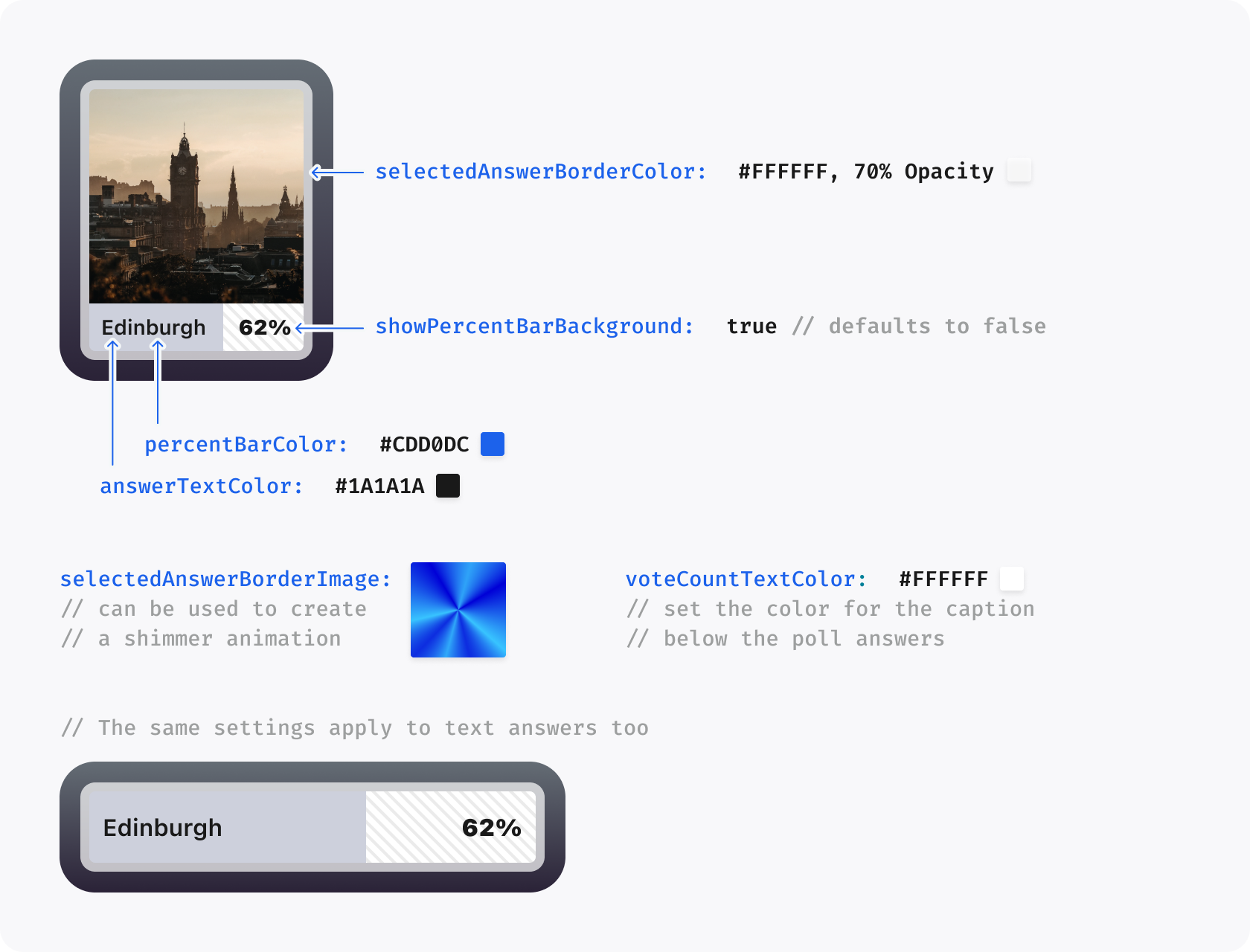
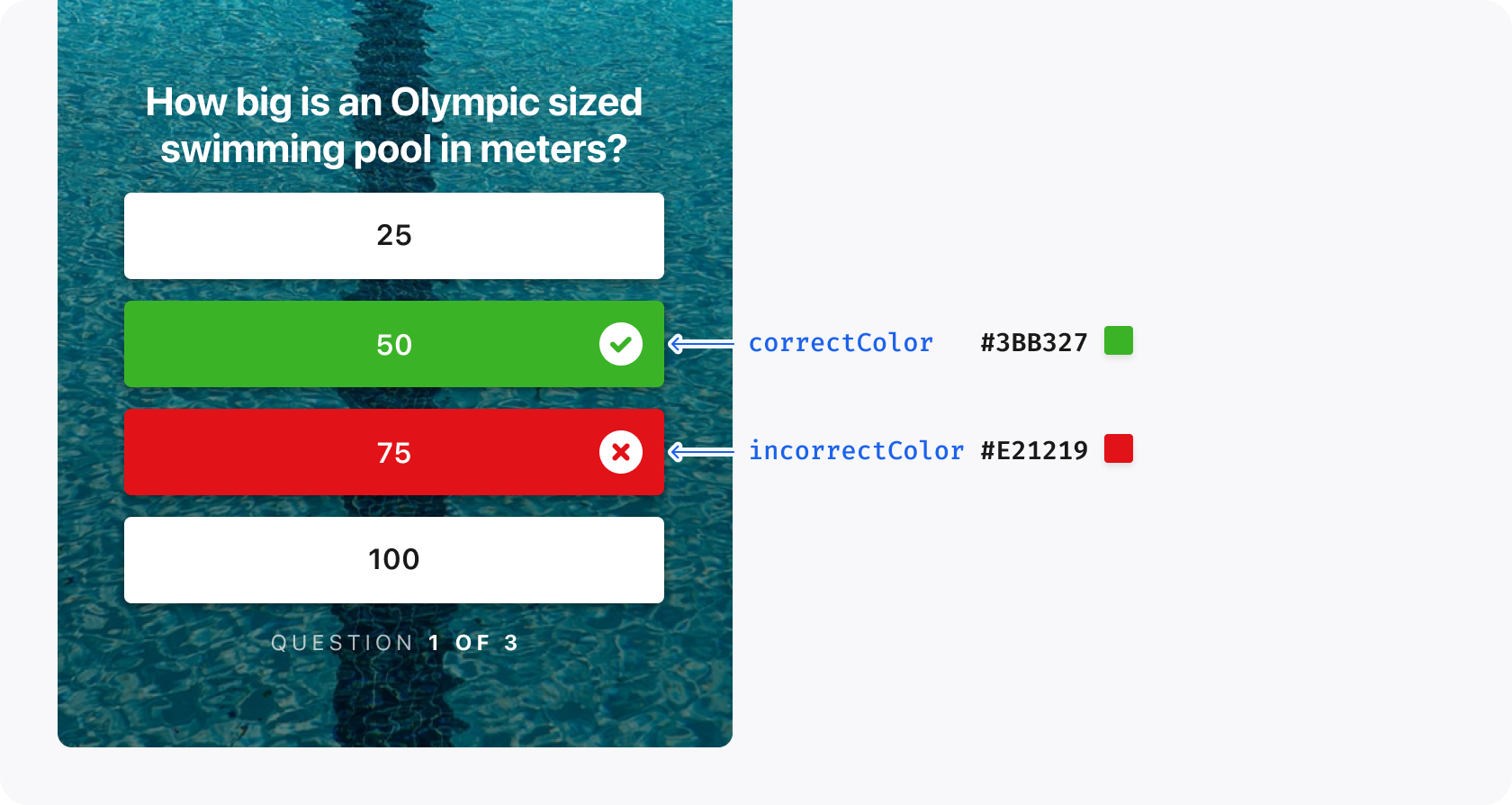
The appearance of the SDK can be customized using the StorytellerTheme class. This class allows you to configure the visual appearance of all Storyteller content in your app.
Set the theme as early as possible in your application's lifecycle (for example, in your main() function after initializing the SDK).
It is also possible to apply a specific theme to an individual StorytellerListView instance or when opening content. For example:
finalrowTheme=StorytellerTheme(light:ThemeType(colors:ThemeColors(primary:'#FF0000'),),);// Apply to a list viewStorytellerStoriesRowView(categories:['news'],theme:rowTheme,);// Apply when opening a collectionawaitStoryteller.openCollection('collection-id',theme:rowTheme,);
For more information on setting a theme on an individual list, see StorytellerListViews.
The Showcase ThemeManager.buildTheme clones the selected preset and adjusts tile typography or singleton layouts on the fly—use it as guidance when composing dynamic StorytellerTheme objects.
The ThemeType object contains all of the properties which can be customized in the SDK.
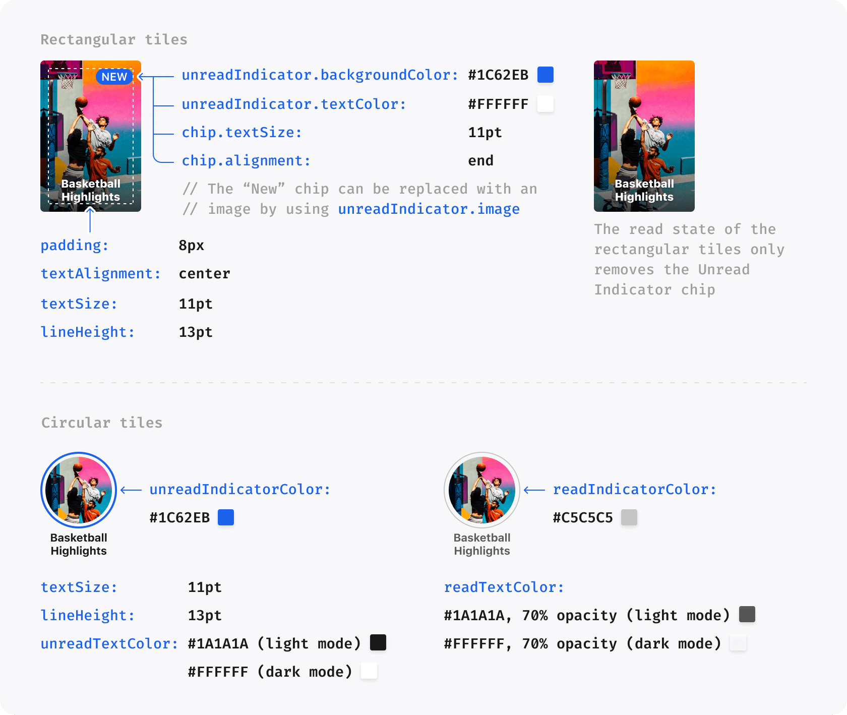
Some properties take their default value from others. For example, setting the primary color to #FF0000 will also result in the New Indicator for Rectangular Tiles being colored red. Such properties are indicated in the tables below.
Note that theme properties may be used for other situations in future.
The colors property on theme is used to establish a set of base colors for the SDK to use.
Property
Default Value
Data Type
Description
primary
#1C62EB
String
The default accent color used throughout the UI. In general, this should be the primary brand color. Color strings should be in hex format (e.g., #1C62EB).
Use the customFont property to set a custom font for use throughout the UI.
Create a ThemeCustomFont with the Flutter asset path for each weight. The
light path is optional for source compatibility; all other paths are required.
Make sure the fonts are properly registered in your app's pubspec.yaml:
flutter:fonts:-family:MyCustomFont-Regularfonts:-asset:fonts/MyCustomFont-Regular.ttf-family:MyCustomFont-Boldfonts:-asset:fonts/MyCustomFont-Bold.ttf# ... other weights
The lists property customizes properties of the various list types available from the SDK.
Property
Default Value
Data Type
Description
backgroundColor
colors.white.primary
String
Required for outline on Live chip and fade to the side of the row
enablePlayerOpen
true
bool
Controls whether the SDK opens the player when a tile is tapped. When set to false, the SDK will not open the player and the app must handle tile taps via the onTileTapped callback.
animateTilesOnReorder
true
bool
When the reloadData() method is called to update lists, a reorder animation is added to visualize the updating process.
row.tileSpacing
8
double
The space between each Tile in a row
row.startInset
12
double
The space before the first Tile in a row
row.endInset
12
double
The space after the last Tile in a row
grid.tileSpacing
8
double
The space between each Tile in a grid, both vertically and horizontally
grid.columns
2
int
The number of columns in a grid.
grid.topInset
12
double
The space before the first row in a grid
grid.bottomInset
12
double
The space after the last row in a grid
title.font
null
ThemeCustomFont
Defines the font of the Title in Section
title.textSize
22
double
Size of the Title in Section
title.lineHeight
28
double
The line height of the Title in Section
title.textCase
default
String
Sets the text case for the Title in Section. Possible values are upper, lower and default
The ThemeGradient class allows for the creation of a color gradient, with options to customize both the colors and the positions at which the gradient starts and ends.
Property
Default Value
Data Type
Description
startColor
required
String
The color where the gradient begins (hex format).
endColor
required
String
The color where the gradient ends (hex format).
startPosition
required
int
The position indicating where the gradient starts (0-8).
endPosition
required
int
The position indicating where the gradient ends (0-8).
The player property is used to customize properties relating to the Story and Clips Player.
Property
Default Value
Data Type
Description
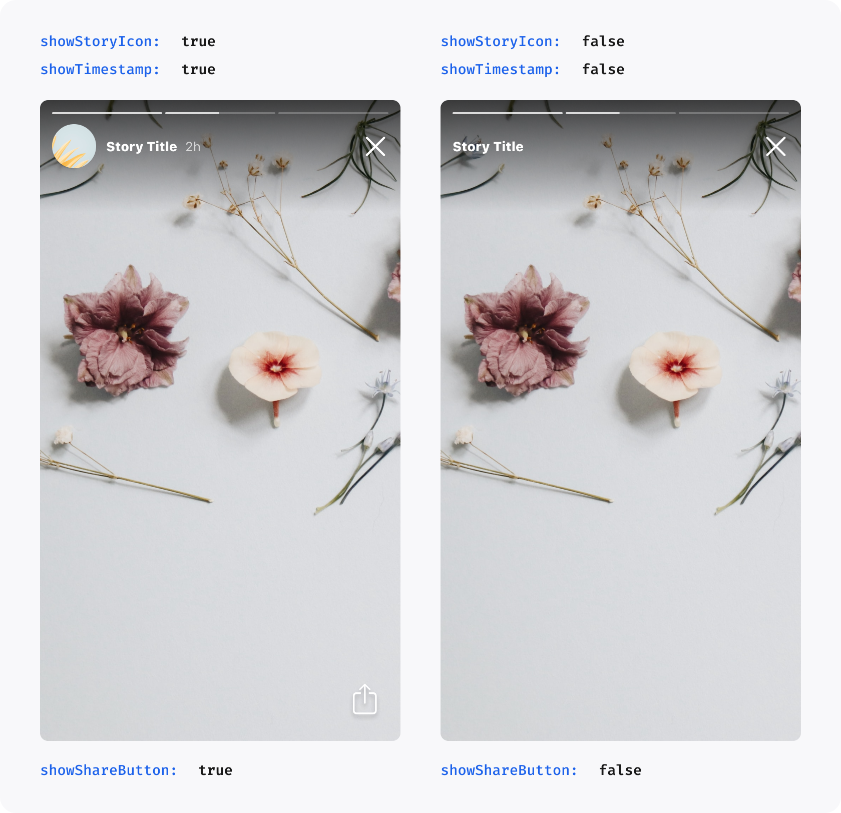
showStoryIcon
false
bool
Shows the round story icon before the Story Title in the Player
showTimestamp
true
bool
Shows the timestamp after the Story Title in the Player, indicating how long ago a story was published
showShareButton
true
bool
Shows the share button in the Player. Setting this to false entirely disables sharing in Storyteller
showLikeButton
true
bool
Shows the like button in the Clips Player. Setting this to false entirely disables liking in Storyteller
showMoreButton
native default
bool
Android-only visibility control for the Clips more button; iOS ignores it
enableFollowableCategorySwipeFromRightEdge
native default
bool
Enables or disables the right-edge swipe that opens a followable category
liveChip.image
null
ThemeImage
Image used in place of Live Chip before Live Story or Clip Titles. If set, it overrides liveChip.backgroundGradient
liveChip.textColor
null
String
Text color used for badge label for Live Story or Clip
liveChip.backgroundGradient
null
ThemeGradient
Background gradient of the badge for Live Story or Clip. If set, it overrides liveChip.backgroundColor
liveChip.backgroundColor
theme.colors.alert
String
Background color of the badge for Live Story or Clip
liveChip.borderColor
null
String
Border color of the badge for Live Story or Clip
icons.share
null
ThemeImage
An image to be used in place of the default share icon
icons.refresh
null
ThemeImage
Refresh button image to be used in place of refresh share icon, used in the error state
icons.back
null
ThemeImage
Back button image used by the native player
icons.close
null
ThemeImage
Android-only close button image; iOS ignores it
icons.more
null
ThemeImage
Android-only more button image; iOS ignores it
icons.likeInitial
null
ThemeImage
An image to be used in place of the default like icon when the clip is not liked
icons.likeLiked
null
ThemeImage
An image to be used in place of the default like icon when the clip is liked
icons.likeAnimation.liked
null
ThemeLottieAnimationResource
Lottie animation used when a clip changes to liked
icons.likeAnimation.unliked
null
ThemeLottieAnimationResource
Lottie animation used when a clip changes to unliked
icons.mute.muted
null
ThemeImage
Mute button image for the muted state
icons.mute.unmuted
null
ThemeImage
Mute button image for the unmuted state
icons.captions.enabled
null
ThemeImage
Captions button image for the enabled state
icons.captions.disabled
null
ThemeImage
Captions button image for the disabled state
clips.showButtonBackgrounds
native default
bool
Controls native action-button backgrounds in the Clips Player
clips.actionIconSize
native default
double
Requested Clips action-icon size; the native SDK applies its supported size rules
clips.eyebrow.*
native defaults
ThemePlayerClipsEyebrow
Font, text size, line height, and color for the Clips eyebrow
clips.title.*
native defaults
ThemePlayerClipsTitle
Font, weight, text size, line height, and color for the Clips title
clips.feedSwitcher.selected.*
native defaults
ThemePlayerClipsFeedSwitcherState
Weight, text size, and line height for the selected Following-feed label
clips.feedSwitcher.unselected.*
native defaults
ThemePlayerClipsFeedSwitcherState
Weight, text size, and line height for an unselected Following-feed label
clips.categoryNavigation.*
native defaults
ThemePlayerClipsCategoryNavigation
Weight, text size, and line height for category-navigation labels
clips.topGradient
native default
ThemeGradient
Readability gradient at the top of the Clips Player
clips.bottomGradient
native default
ThemeGradient
Readability gradient at the bottom of the Clips Player
clips.progressBar.position
native default
String
bottom or aboveAction; native layout remains authoritative
clips.progressBar.playedColor
native default
String
Played-track color
clips.progressBar.remainingColor
native default
String
Remaining-track color
clips.progressBar.active.*
native defaults
ThemePlayerClipsProgressBarActive
Played, remaining, current-time, and total-time colors while scrubbing
clips.spacing.*
native defaults
ThemePlayerClipsSpacing
Insets and gaps: backButtonStartInset, contentInsetHorizontal, contentInsetBottom, actionSpacing, eyebrowToTitleSpacing, titleToActionSpacing, titleToCategoriesSpacing, categoriesToMoreSpacing, metadataToProgressBarSpacing, and progressBarToActionSpacing
On Android, add each Lottie JSON file to android/app/src/main/res/raw and
provide its filename without .json in androidRawResourceName (or name as
a fallback). On iOS, add the JSON file to the app target's Copy Bundle
Resources phase and provide its bundled resource name in name. Use
iosBundlePath when the resource belongs to a bundle other than the main app
bundle.
Use the instructions property to customize the appearance of the instructions screen.
Property
Default Value
Data Type
Description
show
true
bool
Determines whether the Instructions Screen is shown the first time a user opens the Story Player. Set to false to completely disable the instructions screen.
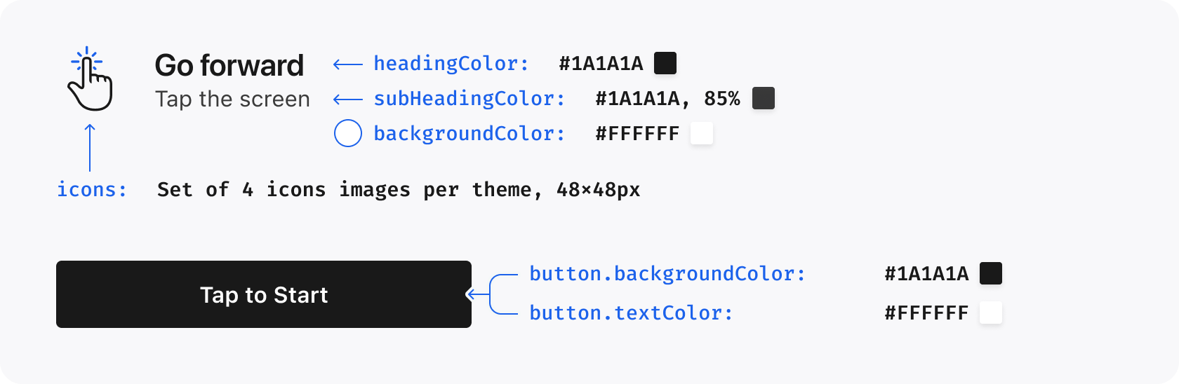
headingColor
inherits colors.black.primary for light, colors.white.primary for dark
String
The color of the heading text on the Instructions Screen
headingTextCase
default
String
Determines the text case of the heading on the Instructions Screen. Possible values are upper, lower and default
headingFont
null
ThemeCustomFont
Defines the font of the heading text on the Instructions Screen
subHeadingColor
inherits colors.black.secondary for light, colors.white.secondary for dark
String
The color of the subheading text on the Instructions Screen
backgroundColor
inherits colors.white.primary for light, colors.black.primary for dark
String
The color of the background of the Instructions Screen
icons
null
ThemeInstructionIcons
A set of custom icons to be used for each instruction on the Instructions Screen
button.backgroundColor
inherits colors.black.primary for light, colors.white.primary for dark
String
The background color of the button used on the Instructions Screen
button.textColor
inherits colors.white.primary for light, colors.black.primary for dark
String
The text color of the button used on the Instructions Screen
The icons property can be used to provide a completely custom set of icons. The icons should be 48x48 PNGs or appropriate asset images. An example of using this property is shown below:
Search filter availability (Sort, Date, and Content Type) is controlled
by the tenant's native Search settings. Local Flutter themes change appearance,
not which filters are enabled. The Following-feed selection mechanism, modal
Clips bottom anchoring, followable-category profile content, and remote theme
precedence are also resolved by native/tenant configuration. Omitted Flutter
theme fields continue to inherit those native values.
{"slug": "themes", "page_title": "Themes", "page_url": "Themes/", "canonical_url": "/flutter/Themes/", "markdown": "# Themes\n\nThe appearance of the SDK can be customized using the `StorytellerTheme` class. This class allows you to configure the visual appearance of all Storyteller content in your app.\n\n```dart\nfinal theme = StorytellerTheme(\n light: ThemeType(\n colors: ThemeColors(primary: '#1C62EB'),\n ),\n);\n\nawait Storyteller.setTheme(theme);\n```\n\nSet the theme as early as possible in your application's lifecycle (for example, in your `main()` function after initializing the SDK).\n\nIt is also possible to apply a specific theme to an individual [StorytellerListView](StorytellerListViews.md) instance or when opening content. For example:\n\n```dart\nfinal rowTheme = StorytellerTheme(\n light: ThemeType(\n colors: ThemeColors(primary: '#FF0000'),\n ),\n);\n\n// Apply to a list view\nStorytellerStoriesRowView(\n categories: ['news'],\n theme: rowTheme,\n);\n\n// Apply when opening a collection\nawait Storyteller.openCollection(\n 'collection-id',\n theme: rowTheme,\n);\n```\n\n> For more information on setting a theme on an individual list, see [StorytellerListViews](StorytellerListViews.md).\n\nThe Showcase [`ThemeManager.buildTheme`](https://github.com/getstoryteller/storyteller-showcase-flutter/blob/main/lib/services/theme_manager.dart#L75) clones the selected preset and adjusts tile typography or singleton layouts on the fly\u2014use it as guidance when composing dynamic `StorytellerTheme` objects.\n\n## Configuring a StorytellerTheme\n\nA `StorytellerTheme` consists of the following properties:\n\n- `light` - sets the `ThemeType` to apply for light mode.\n- `dark` - sets the `ThemeType` to apply for dark mode.\n\nWhich property is used depends on the device's current appearance mode.\n\n## Creating Themes\n\nThe `ThemeType` object contains all of the properties which can be customized in the SDK.\n\nSome properties take their default value from others. For example, setting the `primary` color to `#FF0000` will also result in the New Indicator for Rectangular Tiles being colored red. Such properties are indicated in the tables below.\n\nNote that theme properties may be used for other situations in future.\n\n### Colors\n\nThe `colors` property on theme is used to establish a set of base colors for the SDK to use.\n\n| Property | Default Value | Data Type | Description |\n|----------|---------------|-----------|-------------|\n| `primary` | `#1C62EB` | `String` | The default accent color used throughout the UI. In general, this should be the primary brand color. Color strings should be in hex format (e.g., `#1C62EB`). |\n| `success` | `#3BB327` | `String`| Used to indicate correct answers in Quizzes. |\n| `alert` | `#E21219` | `String`| Used to indicate incorrect answers in Quizzes. |\n| `white.primary` | `#FFFFFF`| `String` | Used for white text |\n| `white.secondary` | `white.primary` at 85% opacity | `String` | Used for light text |\n| `white.tertiary` | `white.primary` at 70% opacity | `String` | Used for gray text |\n| `black.primary` | `#000000`| `String` | Used for black text |\n| `black.secondary` | `black.primary` at 85% opacity | `String` | Used for light black text |\n| `black.tertiary` | `black.primary` at 70% opacity | `String` | Used for gray text |\n\n**Example:**\n```dart\nThemeColors(\n primary: '#1C62EB',\n success: '#3BB327',\n alert: '#E21219',\n white: ThemeTextColors(\n primary: '#FFFFFF',\n secondary: '#D9D9D9',\n tertiary: '#B3B3B3',\n ),\n black: ThemeTextColors(\n primary: '#000000',\n secondary: '#D9D9D9',\n tertiary: '#B3B3B3',\n ),\n)\n```\n\n---\n\n### Font\n\nUse the `customFont` property to set a custom font for use throughout the UI.\n\nCreate a `ThemeCustomFont` with the Flutter asset path for each weight. The\nlight path is optional for source compatibility; all other paths are required.\n\n```dart\nThemeCustomFont(\n lightFilePath: 'fonts/MyCustomFont-Light.ttf',\n regularFilePath: 'fonts/MyCustomFont-Regular.ttf',\n mediumFilePath: 'fonts/MyCustomFont-Medium.ttf',\n semiboldFilePath: 'fonts/MyCustomFont-SemiBold.ttf',\n boldFilePath: 'fonts/MyCustomFont-Bold.ttf',\n heavyFilePath: 'fonts/MyCustomFont-Heavy.ttf',\n blackFilePath: 'fonts/MyCustomFont-Black.ttf',\n)\n```\n\nMake sure the fonts are properly registered in your app's `pubspec.yaml`:\n\n```yaml\nflutter:\n fonts:\n - family: MyCustomFont-Regular\n fonts:\n - asset: fonts/MyCustomFont-Regular.ttf\n - family: MyCustomFont-Bold\n fonts:\n - asset: fonts/MyCustomFont-Bold.ttf\n # ... other weights\n```\n\n---\n\n### Primitives\n\nThe `primitives` object contains base values which are used throughout the UI.\n\n| Property | Default Value | Data Type | Description |\n|----------|---------------|-----------|-------------|\n| `cornerRadius` | `8` | `double` | The corner radius used for rectangular tiles, buttons and poll/quiz answers |\n\n**Example:**\n```dart\nThemePrimitives(\n cornerRadius: 12.0,\n)\n```\n\n---\n\n### Lists\n\nThe `lists` property customizes properties of the various list types available from the SDK.\n\n| Property | Default Value | Data Type | Description |\n| ------------------ | ---------------------- | --------- | -------------------------------------------------------------------------------- |\n| `backgroundColor` | `colors.white.primary` | `String` | Required for outline on Live chip and fade to the side of the row |\n| `enablePlayerOpen` | `true` | `bool` | Controls whether the SDK opens the player when a tile is tapped. When set to `false`, the SDK will not open the player and the app must handle tile taps via the `onTileTapped` callback. |\n| `animateTilesOnReorder` | `true` | `bool` | When the `reloadData()` method is called to update lists, a reorder animation is added to visualize the updating process. |\n| `row.tileSpacing` | `8` | `double` | The space between each Tile in a row |\n| `row.startInset` | `12` | `double` | The space before the first Tile in a row |\n| `row.endInset` | `12` | `double` | The space after the last Tile in a row |\n| `grid.tileSpacing` | `8` | `double` | The space between each Tile in a grid, both vertically and horizontally |\n| `grid.columns` | `2` | `int` | The number of columns in a grid. |\n| `grid.topInset` | `12` | `double` | The space before the first row in a grid |\n| `grid.bottomInset` | `12` | `double` | The space after the last row in a grid |\n| `title.font` | `null` | `ThemeCustomFont` | Defines the font of the Title in Section |\n| `title.textSize` | `22` | `double` | Size of the Title in Section |\n| `title.lineHeight` | `28` | `double` | The line height of the Title in Section |\n| `title.textCase` | `default` | `String` | Sets the text case for the Title in Section. Possible values are `upper`, `lower` and `default` |\n| `title.textColor` | `null` | `String` | Color of Title in Section |\n\n**Example:**\n```dart\nThemeLists(\n backgroundColor: '#FFFFFF',\n enablePlayerOpen: true,\n animateTilesOnReorder: true,\n row: ThemeListRow(\n tileSpacing: 8.0,\n startInset: 12.0,\n endInset: 12.0,\n ),\n grid: ThemeListGrid(\n tileSpacing: 8.0,\n columns: 2,\n topInset: 12.0,\n bottomInset: 12.0,\n ),\n title: ThemeTitle(\n textSize: 22.0,\n lineHeight: 28.0,\n textCase: 'default',\n textColor: '#000000',\n ),\n)\n```\n\n---\n\n### Gradient\n\nThe `ThemeGradient` class allows for the creation of a color gradient, with options to customize both the colors and the positions at which the gradient starts and ends.\n\n| Property | Default Value | Data Type | Description |\n|----------------|---------------|---------------------|------------------------------------------------------|\n| `startColor` | required | `String` | The color where the gradient begins (hex format). |\n| `endColor` | required | `String` | The color where the gradient ends (hex format). |\n| `startPosition`| required | `int` | The position indicating where the gradient starts (0-8). |\n| `endPosition` | required | `int` | The position indicating where the gradient ends (0-8). |\n\n#### Gradient Positions\n\nGradient positions are represented as integers from 0-8:\n\n| Value | Position |\n|-------|----------|\n| `0` | Bottom left corner |\n| `1` | Bottom center edge |\n| `2` | Bottom right corner |\n| `3` | Center left edge |\n| `4` | Center |\n| `5` | Center right edge |\n| `6` | Top left corner |\n| `7` | Top center edge |\n| `8` | Top right corner |\n\n**Example:**\n```dart\nThemeGradient(\n startColor: '#FF0000',\n endColor: '#0000FF',\n startPosition: 6, // Top left\n endPosition: 2, // Bottom right\n)\n```\n\n---\n\n### Tiles\n\nThe `tiles` property can be used to customize the appearance of the Tiles.\n\n| Property | Default Value | Data Type | Description |\n| ------------------------------------------------- | -------------------------------------------------------------------------------- | ----------- | -------------------------------------------------------------------------------------------------------------------------- |\n| `chip.textSize` | `11` | `double` | Text size for the New Indicator and Live Indicator. |\n| `chip.show` | `true` | `bool` | Used to show/hide the new/live chip |\n| `title.textSize` | `11` | `double` | Size of the Title on a Tile |\n| `title.lineHeight` | `13` | `double` | The line height of the Title on a Tile |\n| `title.alignment` | `center` | `String` | The alignment of the Title on a Tile. Possible values are `left`, `center` and `right` |\n| `circularTile.title.unreadTextColor` | inherits `colors.black.primary` for `light`, `colors.white.primary` for `dark` | `String` | The text color of the Title for a circular tile when the story or the clip is unread |\n| `circularTile.title.readTextColor` | inherits `colors.black.tertiary` for `light`, `colors.white.tertiary` for `dark` | `String` | The text color of the Tile for a circular tile when the story or the clip is read |\n| `circularTile.unreadIndicatorColor` | inherits `colors.primary` | `String` | The color of the ring around a circular tile when the story or the clip is unread |\n| `circularTile.readIndicatorColor` | `#C5C5C5` | `String` | The color of the ring around a circular tile when the story or the clip is read |\n| `circularTile.unreadIndicatorGradient` | `null` | `ThemeGradient` | The gradient of the ring around a circular tile when the story or the clip is unread. If set, overrides `circularTile.unreadIndicatorColor` |\n| `circularTile.unreadIndicatorBorderColor` | `null` | `String` | The border color of the ring around a circular tile when the story or the clip is unread |\n| `circularTile.readIndicatorBorderColor` | `null` | `String` | The border color of the ring around a circular tile when the story or the clip is read |\n| `circularTile.unreadBorderWidth` | `2` | `double` | The width of Circular Tile ring border in unread state |\n| `circularTile.readBorderWidth` | `2` | `double` | The width of Circular Tile ring border in read state |\n| `circularTile.liveChip.readImage` | `null` | `ThemeImage` | Image to be used in place of default read Live Indicator. |\n| `circularTile.liveChip.unreadImage` | `null` | `ThemeImage` | Image to be used in place of default unread Live Indicator |\n| `circularTile.liveChip.unreadBackgroundColor` | `colors.alert` | `String` | Background color of the Live Indicator when the story contains unread pages or the clip has not been viewed. |\n| `circularTile.liveChip.readBackgroundColor` | `colors.black.tertiary` | `String` | Background color of the Live Indicator when all story pages have been read or the clip has been viewed. |\n| `circularTile.liveChip.unreadBackgroundGradient` | `null` | `ThemeGradient` | The gradient of the ring around a live tile and background of the Live Indicator. If set, overrides `circularTile.liveChip.unreadBackgroundColor` |\n| `circularTile.liveChip.unreadTextColor` | `colors.white.primary` | `String` | Text color of the Live Indicator when the story contains unread pages or the clip has not been viewed. |\n| `circularTile.liveChip.readTextColor` | `colors.white.primary` | `String` | Text color of the Live Indicator when all story pages have been read or the clip has been viewed. |\n| `circularTile.liveChip.unreadBorderColor` | `null` | `String` | Border color of the Live Indicator when the story contains unread pages or the clip has not been viewed. |\n| `circularTile.liveChip.readBorderColor` | `null` | `String` | Border color of the Live Indicator when all story pages have been read or the clip has been viewed. |\n| `rectangularTile.padding` | `8` | `double` | The internal padding for a rectangular story or the clip tile |\n| `rectangularTile.title.textColor` | inherits `colors.white.primary` | `String` | The text color of the Title for a rectangular tile |\n| `rectangularTile.chip.alignment` | `right` | `String` | The alignment of the New Indicator and Live Indicator in Rectangular Tiles. Possible values are `left`, `center` or `right` |\n| `rectangularTile.unreadIndicator.image` | `null` | `ThemeImage` | An image which can be used in place of the default unread indicator for a rectangular tile. If set, overrides `rectangularTile.unreadIndicator.gradient` |\n| `rectangularTile.unreadIndicator.gradient` | `null` | `ThemeGradient` | The background gradient of the unread indicator for a rectangular tile. If set, overrides `rectangularTile.unreadIndicator.backgroundColor` |\n| `rectangularTile.unreadIndicator.backgroundColor` | inherits `colors.primary` | `String` | The background color of the unread indicator for a rectangular tile |\n| `rectangularTile.unreadIndicator.textColor` | inherits `colors.white.primary` | `String` | The text color of the unread indicator for a rectangular tile |\n| `rectangularTile.unreadIndicator.borderColor` | `null` | `String` | Border color of the unread indicator for a rectangular tile |\n| `rectangularTile.liveChip.readImage` | `null` | `ThemeImage` | Image to be used in place of default read Live Indicator. |\n| `rectangularTile.liveChip.unreadImage` | `null` | `ThemeImage` | Image to be used in place of default unread Live Indicator. If set, overrides `rectangularTile.liveChip.unreadBackgroundGradient` |\n| `rectangularTile.liveChip.unreadBackgroundGradient` | `null` | `ThemeGradient` | Gradient background to be used for the Live Indicator. If set, overrides `rectangularTile.liveChip.unreadBackgroundColor` |\n| `rectangularTile.liveChip.unreadBackgroundColor` | `colors.alert` | `String` | Background color of the Live Indicator when the story contains unread pages or the clip has not been viewed. |\n| `rectangularTile.liveChip.readBackgroundColor` | `colors.black.tertiary` | `String` | Background color of the Live Indicator when all pages have been read or the clip has been viewed |\n| `rectangularTile.liveChip.unreadTextColor` | `colors.white.primary` | `String` | Text color of the Live Indicator when the story contains unread pages or the clip has not been viewed. |\n| `rectangularTile.liveChip.readTextColor` | `colors.white.primary` | `String` | Text color of the Live Indicator when all story pages have been read or the clip has been viewed. |\n| `rectangularTile.liveChip.unreadBorderColor` | `null` | `String` | Border color of the Live Indicator when the story contains unread pages or the clip has not been viewed. |\n| `rectangularTile.liveChip.readBorderColor` | `null` | `String` | Border color of the Live Indicator when all story pages have been read or the clip has been viewed. |\n\n\n\n\n\n**Example:**\n```dart\nThemeTiles(\n chip: ThemeTileChip(\n textSize: 11.0,\n show: true,\n ),\n title: ThemeTileTitle(\n textSize: 11.0,\n lineHeight: 13.0,\n alignment: 'center',\n ),\n circularTile: ThemeCircularTile(\n unreadIndicatorColor: '#1C62EB',\n readIndicatorColor: '#C5C5C5',\n unreadBorderWidth: 2.0,\n readBorderWidth: 2.0,\n ),\n rectangularTile: ThemeRectangularTile(\n padding: 8.0,\n title: ThemeRectangularTileTitle(\n textColor: '#FFFFFF',\n ),\n ),\n)\n```\n\n---\n\n### Cards\n\nThe `cards` property customizes controls rendered inside native Cards\ncollections.\n\n| Property | Default Value | Data Type | Description |\n|----------|---------------|-----------|-------------|\n| `audio.mutedIcon` | native icon | `ThemeImage` | Audio-control image shown while a video Card is muted |\n| `audio.unmutedIcon` | native icon | `ThemeImage` | Audio-control image shown while a video Card is unmuted |\n| `audio.unavailableIcon` | native icon | `ThemeImage` | Android-only image shown when a video Card has no audio; iOS ignores this optional field |\n\n```dart\nThemeCards(\n audio: ThemeCardsAudio(\n mutedIcon: ThemeImage(filePath: 'assets/icons/card_muted.png'),\n unmutedIcon: ThemeImage(filePath: 'assets/icons/card_unmuted.png'),\n unavailableIcon: ThemeImage(\n filePath: 'assets/icons/card_audio_unavailable.png',\n ),\n ),\n)\n```\n\n---\n\n### Player\n\nThe `player` property is used to customize properties relating to the Story and Clips Player.\n\n| Property | Default Value | Data Type | Description |\n|----------|---------------|-----------|-------------|\n| `showStoryIcon` | `false` | `bool` | Shows the round story icon before the Story Title in the Player |\n| `showTimestamp` | `true` | `bool` | Shows the timestamp after the Story Title in the Player, indicating how long ago a story was published |\n| `showShareButton` | `true` | `bool` | Shows the share button in the Player. Setting this to `false` entirely disables sharing in Storyteller |\n| `showLikeButton` | `true` | `bool` | Shows the like button in the Clips Player. Setting this to `false` entirely disables liking in Storyteller |\n| `showMoreButton` | native default | `bool` | Android-only visibility control for the Clips more button; iOS ignores it |\n| `enableFollowableCategorySwipeFromRightEdge` | native default | `bool` | Enables or disables the right-edge swipe that opens a followable category |\n| `liveChip.image` | `null` | `ThemeImage` | Image used in place of Live Chip before Live Story or Clip Titles. If set, it overrides `liveChip.backgroundGradient` |\n| `liveChip.textColor` | `null` | `String` | Text color used for badge label for Live Story or Clip |\n| `liveChip.backgroundGradient` | `null` | `ThemeGradient` | Background gradient of the badge for Live Story or Clip. If set, it overrides `liveChip.backgroundColor` |\n| `liveChip.backgroundColor` | `theme.colors.alert` | `String` | Background color of the badge for Live Story or Clip |\n| `liveChip.borderColor` | `null` | `String` | Border color of the badge for Live Story or Clip |\n| `icons.share` | `null` | `ThemeImage` | An image to be used in place of the default share icon |\n| `icons.refresh` | `null` | `ThemeImage` | Refresh button image to be used in place of refresh share icon, used in the error state |\n| `icons.back` | `null` | `ThemeImage` | Back button image used by the native player |\n| `icons.close` | `null` | `ThemeImage` | Android-only close button image; iOS ignores it |\n| `icons.more` | `null` | `ThemeImage` | Android-only more button image; iOS ignores it |\n| `icons.likeInitial` | `null` | `ThemeImage` | An image to be used in place of the default like icon when the clip is not liked |\n| `icons.likeLiked` | `null` | `ThemeImage` | An image to be used in place of the default like icon when the clip is liked |\n| `icons.likeAnimation.liked` | `null` | `ThemeLottieAnimationResource` | Lottie animation used when a clip changes to liked |\n| `icons.likeAnimation.unliked` | `null` | `ThemeLottieAnimationResource` | Lottie animation used when a clip changes to unliked |\n| `icons.mute.muted` | `null` | `ThemeImage` | Mute button image for the muted state |\n| `icons.mute.unmuted` | `null` | `ThemeImage` | Mute button image for the unmuted state |\n| `icons.captions.enabled` | `null` | `ThemeImage` | Captions button image for the enabled state |\n| `icons.captions.disabled` | `null` | `ThemeImage` | Captions button image for the disabled state |\n| `clips.showButtonBackgrounds` | native default | `bool` | Controls native action-button backgrounds in the Clips Player |\n| `clips.actionIconSize` | native default | `double` | Requested Clips action-icon size; the native SDK applies its supported size rules |\n| `clips.eyebrow.*` | native defaults | `ThemePlayerClipsEyebrow` | Font, text size, line height, and color for the Clips eyebrow |\n| `clips.title.*` | native defaults | `ThemePlayerClipsTitle` | Font, weight, text size, line height, and color for the Clips title |\n| `clips.feedSwitcher.selected.*` | native defaults | `ThemePlayerClipsFeedSwitcherState` | Weight, text size, and line height for the selected Following-feed label |\n| `clips.feedSwitcher.unselected.*` | native defaults | `ThemePlayerClipsFeedSwitcherState` | Weight, text size, and line height for an unselected Following-feed label |\n| `clips.categoryNavigation.*` | native defaults | `ThemePlayerClipsCategoryNavigation` | Weight, text size, and line height for category-navigation labels |\n| `clips.topGradient` | native default | `ThemeGradient` | Readability gradient at the top of the Clips Player |\n| `clips.bottomGradient` | native default | `ThemeGradient` | Readability gradient at the bottom of the Clips Player |\n| `clips.progressBar.position` | native default | `String` | `bottom` or `aboveAction`; native layout remains authoritative |\n| `clips.progressBar.playedColor` | native default | `String` | Played-track color |\n| `clips.progressBar.remainingColor` | native default | `String` | Remaining-track color |\n| `clips.progressBar.active.*` | native defaults | `ThemePlayerClipsProgressBarActive` | Played, remaining, current-time, and total-time colors while scrubbing |\n| `clips.spacing.*` | native defaults | `ThemePlayerClipsSpacing` | Insets and gaps: `backButtonStartInset`, `contentInsetHorizontal`, `contentInsetBottom`, `actionSpacing`, `eyebrowToTitleSpacing`, `titleToActionSpacing`, `titleToCategoriesSpacing`, `categoriesToMoreSpacing`, `metadataToProgressBarSpacing`, and `progressBarToActionSpacing` |\n\nOn Android, add each Lottie JSON file to `android/app/src/main/res/raw` and\nprovide its filename without `.json` in `androidRawResourceName` (or `name` as\na fallback). On iOS, add the JSON file to the app target's Copy Bundle\nResources phase and provide its bundled resource name in `name`. Use\n`iosBundlePath` when the resource belongs to a bundle other than the main app\nbundle.\n\n\n\n**Example:**\n```dart\nThemePlayer(\n showStoryIcon: false,\n showTimestamp: true,\n showShareButton: true,\n showLikeButton: true,\n enableFollowableCategorySwipeFromRightEdge: true,\n icons: ThemePlayerIcons(\n share: ThemeImage(filePath: 'assets/icons/share.png'),\n back: ThemeImage(filePath: 'assets/icons/back.png'),\n likeInitial: ThemeImage(filePath: 'assets/icons/like.png'),\n likeLiked: ThemeImage(filePath: 'assets/icons/like_filled.png'),\n mute: ThemePlayerMuteIcons(\n muted: ThemeImage(filePath: 'assets/icons/muted.png'),\n unmuted: ThemeImage(filePath: 'assets/icons/unmuted.png'),\n ),\n captions: ThemePlayerCaptionsIcons(\n enabled: ThemeImage(filePath: 'assets/icons/captions_on.png'),\n disabled: ThemeImage(filePath: 'assets/icons/captions_off.png'),\n ),\n likeAnimation: ThemePlayerLikeAnimation(\n liked: ThemeLottieAnimationResource(\n name: 'like_lottie',\n androidRawResourceName: 'like_lottie',\n ),\n unliked: ThemeLottieAnimationResource(\n name: 'unlike_lottie',\n androidRawResourceName: 'unlike_lottie',\n ),\n ),\n ),\n clips: ThemePlayerClips(\n showButtonBackgrounds: true,\n actionIconSize: 34,\n title: ThemePlayerClipsTitle(\n fontWeight: 'bold',\n textSize: 18,\n lineHeight: 22,\n textColor: '#FFFFFF',\n ),\n progressBar: ThemePlayerClipsProgressBar(\n position: 'aboveAction',\n playedColor: '#1C62EB',\n remainingColor: '#80FFFFFF',\n ),\n spacing: ThemePlayerClipsSpacing(\n contentInsetHorizontal: 16,\n contentInsetBottom: 20,\n actionSpacing: 12,\n ),\n ),\n)\n```\n\n---\n\n### Buttons\n\nThe `buttons` property applies customizations to buttons which appear throughout the UI.\n\n| Property | Default Value | Data Type | Description |\n|----------|---------------|-----------|-------------|\n| `backgroundColor` | inherits `colors.white.primary` | `String` | The background color of buttons throughout the UI |\n| `textColor` | inherits `colors.black.primary` | `String` | The text color of buttons throughout the SDK |\n| `textCase` | `default` | `String` | Sets the text case for buttons throughout the UI. Possible values are `upper`, `lower` and `default` |\n| `cornerRadius` | inherits `primitives.cornerRadius` | `double` | The corner radius for all buttons throughout the UI |\n\n**Example:**\n```dart\nThemeButtons(\n backgroundColor: '#000000',\n textColor: '#FFFFFF',\n textCase: 'upper',\n cornerRadius: 8.0,\n)\n```\n\n---\n\n### Instructions\n\nUse the `instructions` property to customize the appearance of the instructions screen.\n\n| Property | Default Value | Data Type | Description |\n|----------|---------------|-----------|-------------|\n| `show` | `true` | `bool` | Determines whether the Instructions Screen is shown the first time a user opens the Story Player. Set to `false` to completely disable the instructions screen. |\n| `headingColor` | inherits `colors.black.primary` for `light`, `colors.white.primary` for `dark` | `String` | The color of the heading text on the Instructions Screen |\n| `headingTextCase` | `default` | `String` | Determines the text case of the heading on the Instructions Screen. Possible values are `upper`, `lower` and `default` |\n| `headingFont` | `null` | `ThemeCustomFont` | Defines the font of the heading text on the Instructions Screen |\n| `subHeadingColor` | inherits `colors.black.secondary` for `light`, `colors.white.secondary` for `dark` | `String` | The color of the subheading text on the Instructions Screen |\n| `backgroundColor` | inherits `colors.white.primary` for `light`, `colors.black.primary` for `dark` | `String` | The color of the background of the Instructions Screen |\n| `icons` | `null` | `ThemeInstructionIcons` | A set of custom icons to be used for each instruction on the Instructions Screen |\n| `button.backgroundColor` | inherits `colors.black.primary` for `light`, `colors.white.primary` for `dark` | `String` | The background color of the button used on the Instructions Screen |\n| `button.textColor` | inherits `colors.white.primary` for `light`, `colors.black.primary` for `dark` | `String` | The text color of the button used on the Instructions Screen |\n\nThe `icons` property can be used to provide a completely custom set of icons. The icons should be 48x48 PNGs or appropriate asset images. An example of using this property is shown below:\n\n```dart\nThemeInstructionIcons(\n forward: ThemeImage(filePath: 'assets/icons/forward.png'),\n pause: ThemeImage(filePath: 'assets/icons/pause.png'),\n back: ThemeImage(filePath: 'assets/icons/back.png'),\n move: ThemeImage(filePath: 'assets/icons/move.png'),\n)\n```\n\n\n\n**Example:**\n```dart\nThemeInstructions(\n show: true,\n headingColor: '#000000',\n headingTextCase: 'default',\n subHeadingColor: '#666666',\n backgroundColor: '#FFFFFF',\n button: ThemeInstructionButton(\n backgroundColor: '#000000',\n textColor: '#FFFFFF',\n ),\n)\n```\n\n---\n\n### Engagement Units\n\nThe `engagementUnits` property can be used to customize properties relating to Polls and Quizzes.\n\n| Property | Default Value | Data Type | Description |\n|----------|---------------|-----------|-------------|\n| `poll.answerTextColor` | inherits `colors.black.primary` | `String` | The text color used for Poll Answers |\n| `poll.percentBarColor` | `#CDD0DC` | `String` | The background color of the percentage bar in Poll Answers |\n| `poll.selectedAnswerBorderColor` | inherits `colors.primary` | `String` | The border color applied to the selected Poll Answer |\n| `poll.answeredMessageTextColor` | inherits `colors.white.tertiary` | `String` | The color of the vote count shown to users after they select a Poll Answer |\n| `poll.selectedAnswerBorderImage` | `null` | `ThemeImage` | A border image which can be used for the selected Poll Answer. If this is set, `selectedAnswerBorderColor` is used. |\n| `poll.showImageAnswerGradientOverlay` | `null` | `bool` | Controls whether image poll answers show the native gradient overlay |\n| `triviaQuiz.correctColor` | inherits `colors.success` | `String` | The color used to show correct answers in Trivia Quizzes |\n| `triviaQuiz.incorrectColor` | inherits `colors.alert` | `String` | The color used to show incorrect answers in Trivia Quizzes |\n\n\n\n\n\n**Example:**\n```dart\nThemeEngagementUnits(\n poll: ThemePoll(\n answerTextColor: '#000000',\n percentBarColor: '#CDD0DC',\n selectedAnswerBorderColor: '#1C62EB',\n showImageAnswerGradientOverlay: true,\n ),\n triviaQuiz: ThemeTriviaQuiz(\n correctColor: '#3BB327',\n incorrectColor: '#E21219',\n ),\n)\n```\n\n---\n\n### Search\n\nThe `search` property applies customizations to the Search component.\n\n| Property | Default Value | Data Type | Description |\n|----------|---------------|-----------|-------------|\n| `backIcon` | default back icon | `ThemeImage` | Image to be used as a back icon in the Search UI |\n| `backgroundColor` | native default | `String` | Search screen background color |\n| `heading.font` | inherits `lists.title.font` | `ThemeCustomFont` | Defines the styling of the Filters title in the Filter View |\n| `heading.textSize` | inherits `lists.title.textSize` | `double` | Size of the Filter View title |\n| `heading.lineHeight` | inherits `lists.title.lineHeight` | `double` | The line height of the Filter View title |\n| `heading.textCase` | inherits `lists.title.textCase` | `String` | Sets the text case for Filter View title. Possible values are `upper`, `lower` and `default` |\n| `heading.textColor` | inherits `lists.title.textColor` | `String` | Color of Filter View title |\n| `input.*` | native defaults | `ThemeSearchInput` | Input background, text, placeholder, icon, corner radius, text size, and line height |\n| `filterButton.*` | native defaults | `ThemeSearchFilterButton` | Filter-button background, icon color, and corner radius |\n| `suggestions.*` | native defaults | `ThemeSearchSuggestions` | Suggestion text/icon colors, icon background, text size, and line height |\n| `noResults.iconColor` | native default | `String` | No-results icon color |\n| `noResults.title.*` | native defaults | `ThemeSearchTextStyle` | No-results title color, size, line height, and case |\n| `noResults.message.*` | native defaults | `ThemeSearchTextStyle` | No-results message color, size, line height, and case |\n| `filters.backgroundColor` | native default | `String` | Filter-sheet background color |\n| `filters.handleColor` | native default | `String` | Filter-sheet drag-handle color |\n| `filters.sectionHeading.*` | native defaults | `ThemeSearchTextStyle` | Filter-section heading color, size, line height, and case |\n| `filters.option.*` | native defaults | `ThemeSearchFilterOption` | Normal/selected option colors and borders, corner radius, text size, and line height |\n| `filters.applyButton.*` | native defaults | `ThemeButtons` | Apply-button background, text color, text case, and corner radius |\n\n**Example:**\n```dart\nThemeSearch(\n backgroundColor: '#F7F9FC',\n backIcon: ThemeImage(filePath: 'assets/icons/back.png'),\n input: ThemeSearchInput(\n backgroundColor: '#FFFFFF',\n textColor: '#172033',\n placeholderTextColor: '#667085',\n iconColor: '#1C62EB',\n cornerRadius: 12,\n ),\n filterButton: ThemeSearchFilterButton(\n backgroundColor: '#E8EEFF',\n iconColor: '#1C62EB',\n cornerRadius: 12,\n ),\n heading: ThemeTitle(\n textSize: 22.0,\n lineHeight: 28.0,\n textCase: 'default',\n textColor: '#000000',\n ),\n filters: ThemeSearchFilters(\n backgroundColor: '#FFFFFF',\n handleColor: '#98A2B3',\n option: ThemeSearchFilterOption(\n selectedBackgroundColor: '#1C62EB',\n selectedTextColor: '#FFFFFF',\n cornerRadius: 8,\n ),\n applyButton: ThemeButtons(\n backgroundColor: '#1C62EB',\n textColor: '#FFFFFF',\n ),\n ),\n)\n```\n\nSearch filter availability (`Sort`, `Date`, and `Content Type`) is controlled\nby the tenant's native Search settings. Local Flutter themes change appearance,\nnot which filters are enabled. The Following-feed selection mechanism, modal\nClips bottom anchoring, followable-category profile content, and remote theme\nprecedence are also resolved by native/tenant configuration. Omitted Flutter\ntheme fields continue to inherit those native values.\n\n---\n\n### Home\n\nThe `home` property can be used to customize properties related to the Storyteller Home component.\n\n| Property | Default Value | Data Type | Description |\n|----------|---------------|-----------|-------------|\n| `headerTitle.font` | `null` | `ThemeCustomFont` | Defines the font for the heading |\n| `headerTitle.textSize` | `22` | `double` | Size of the title in section |\n| `headerTitle.lineHeight` | `28` | `double` | The line height of the title in section |\n| `headerTitle.textCase` | `default` | `String` | Sets the text case for the title. Possible values are `upper`, `lower` and `default` |\n| `headerTitle.textColor` | `null` | `String` | Color of heading text in Storyteller Home |\n| `circularTitle.textSize` | `11` | `double` | Size of the circular title in section |\n| `circularTitle.lineHeight` | `13` | `double` | The line height of the circular title in section |\n| `singletonTitle.textSize` | `22` | `double` | Size of the singleton title in section |\n| `singletonTitle.lineHeight` | `28` | `double` | The line height of the singleton title in section |\n| `gridTitle.textSize` | `16` | `double` | Size of the grid title in section |\n| `gridTitle.lineHeight` | `22` | `double` | The line height of the grid title in section |\n\n**Example:**\n```dart\nThemeHome(\n headerTitle: ThemeTitle(\n textSize: 22.0,\n lineHeight: 28.0,\n textCase: 'default',\n textColor: '#000000',\n ),\n circularTitle: ThemeHomeTitle(\n textSize: 11.0,\n lineHeight: 13.0,\n ),\n)\n```\n", "copy_markdown_include_header": false, "base_path": "", "ai_dir": "ai", "missing_payload_behavior": "empty"}