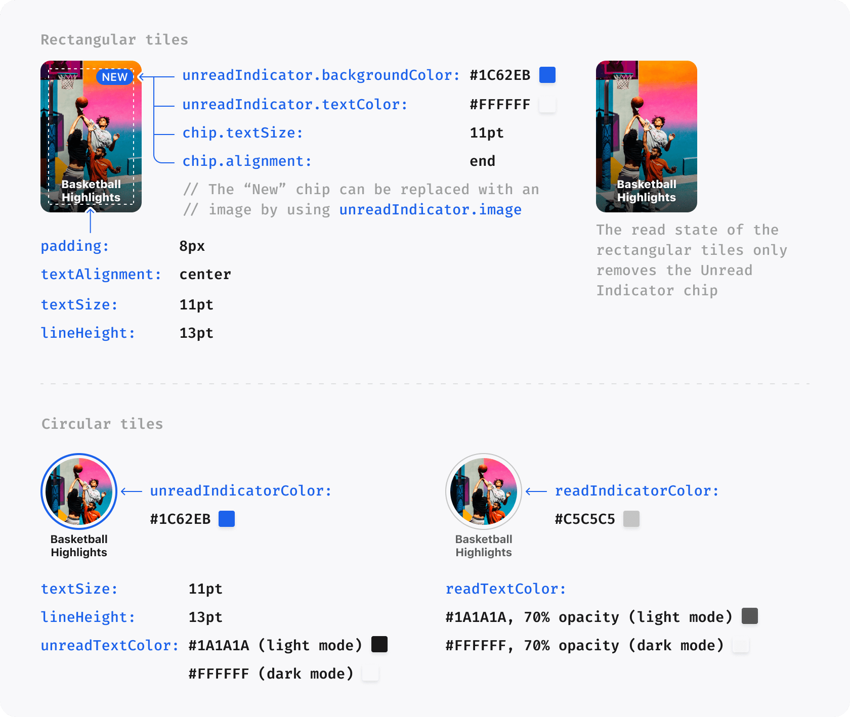
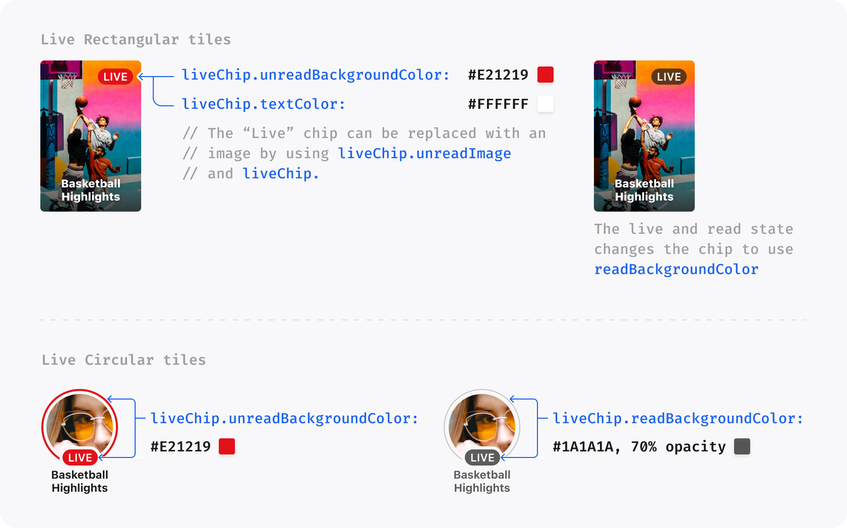
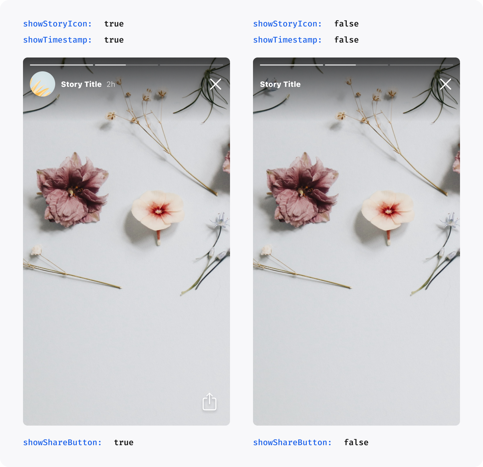
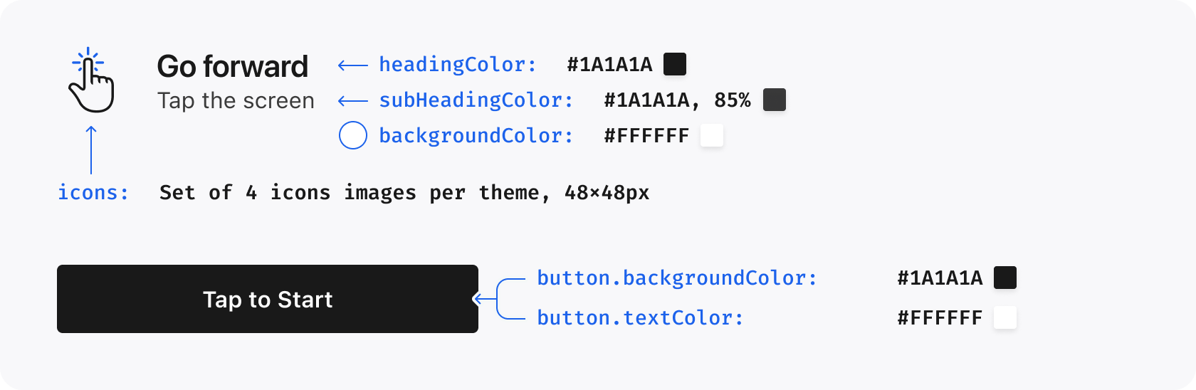
The appearance of the SDK can be customized by setting the Storyteller.theme global property
or StorytellerListView.theme view property. This requires a UiTheme configuration object.
Note: global theme should be set before any of the Storyteller list views are inflated.
Note: this property will be used as fallback theming style used to render Story items in lists and activities launched from list.
See StorytellerLists or StorytellerListViews (legacy).
UiTheme is a data structure containing tree of the parameters. While it's possible to manually declare
a whole structure of this data object, for convenience it's recommended to use
UiTheme DSL for that purpose.
A Theme contains various settings which change visual aspects of the Storyteller SDK. All
properties are optional. In general, it should be possible to obtain a custom look by only using
the colors properties - however, if you require more fine-grained control, that is also available.
The colors property on theme is used to establish a set of base colors for the SDK to use.
Colors
Description
Default Value
Dark Value
theme.colors.primary
Default accent color used throughout the UI. Usually the primary brand color. Used for: Unread Indicators, loading progress bars and spinners on Android.
#1C62EB
theme.colors.success
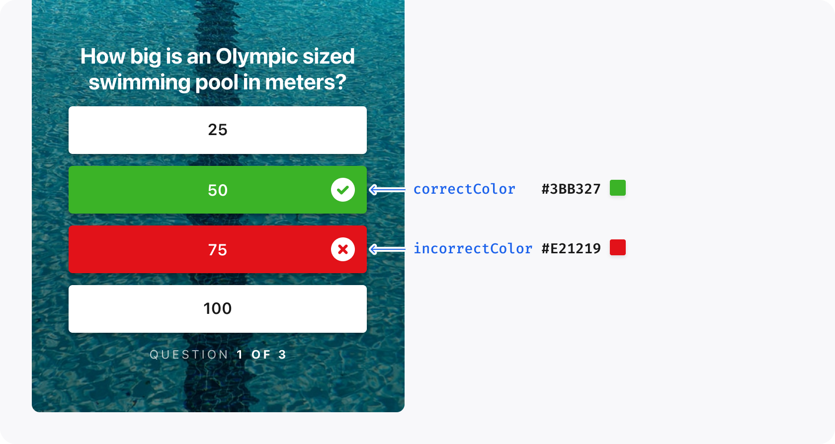
Used to indicate correct answers in Quizzes.
#3BB327
theme.colors.alert
Used to indicate wrong answers in Quizzes and for the 'Live' indicator on Live Stories.
#E21219
theme.colors.white.primary
Used for Story names on rectangular tiles and in the player. Also used for all primary text in dark mode by default.
#ffffff
theme.colors.white.secondary
Used for secondary text in dark mode.
rgba({theme.colors.white.primary}, 85%)
theme.colors.white.tertiary
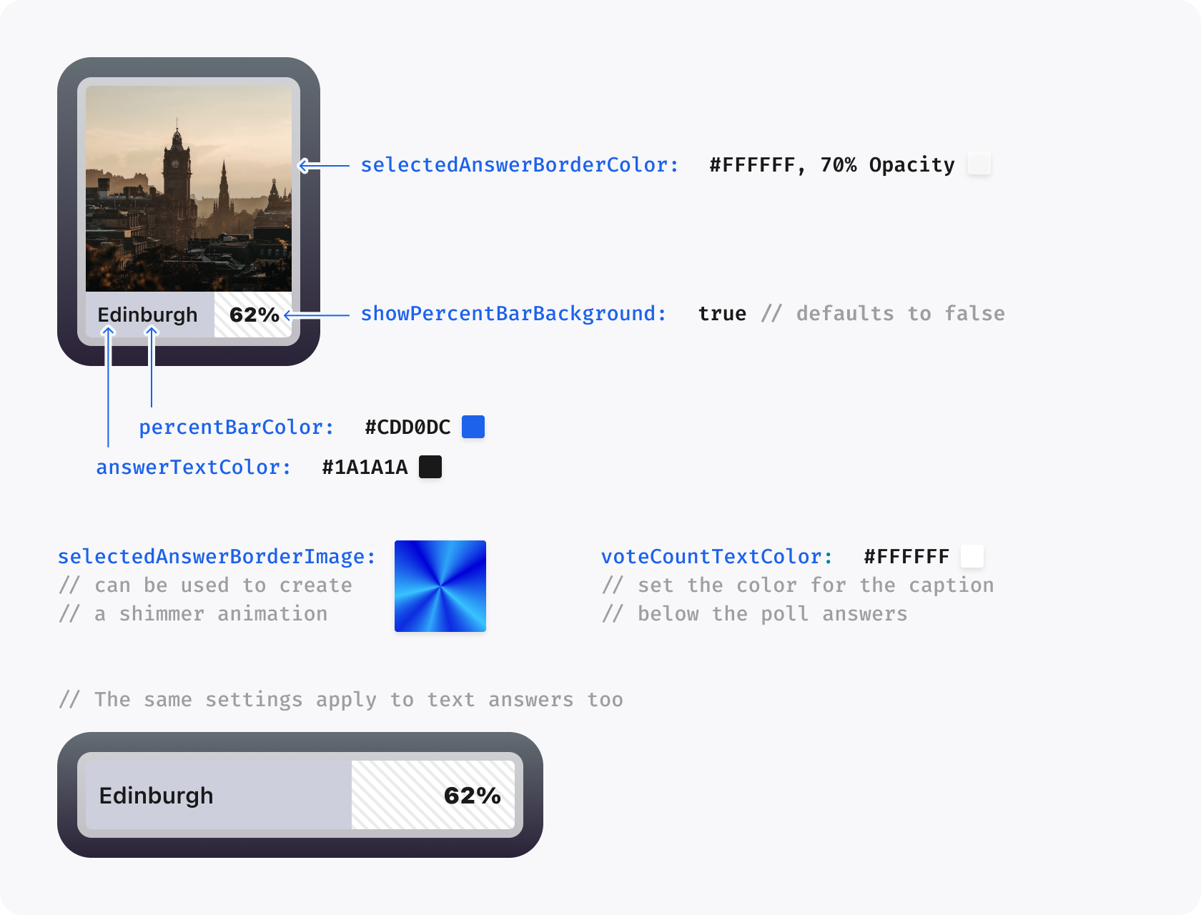
Used for tertiary text in dark mode, e.g. the time stamp in the player header. Also used for the selected Poll option border.
rgba({theme.colors.white.primary}, 70%)
theme.colors.black.primary
Used for primary text in light mode by default.
#1A1A1A
theme.colors.black.secondary
Used for secondary text in light mode.
rgba({theme.colors.black.primary}, 85%)
theme.colors.black.tertiary
Used for tertiary text and minor UI elements in light mode.
Use the font property to set a custom font for use throughout the UI.
Font
Description
Default Value
Dark Value
theme.font
Font to be used throughout the UI, defaults to the system font on each platform or inherits the container font on web. Font definition requires access to different weights to work properly.
The lists customize properties of the various list types available from the SDK.
Lists
Description
Default Value
Dark Value
theme.lists.title
The style of the title on Story or Clip tile.
8 dp
theme.lists.row.tileSpacing
The space between each Story and Clip Tile in a row.
8 dp
theme.lists.row.startInset
The space before the first tile in a row.
12 dp
theme.lists.row.endInset
The space after the last tile in a row.
12 dp
theme.lists.grid.tileSpacing
The space between Story and Clip Tiles in a grid, both vertically and horizontally.
8 dp
theme.lists.grid.columns
Number of columns in the grid.
2 dp
theme.lists.grid.topInset
The space at the top of the first row in a grid.
0 dp
theme.lists.grid.bottomInset
The space at the bottom of the last row in a grid.
0 dp
theme.lists.backgroundColor
Required for outline on Live chip and fade to the side of the row
{theme.colors.white.primary}
{theme.colors.black.primary}
theme.lists.animateTilesOnReorder
This option allows you to enable animation in lists when updating items
true
true
theme.lists.enablePlayerOpen
Controls whether the SDK opens the player when a tile is tapped. When set to false, the SDK will not open the player and the app must handle tile taps via StorytellerDelegates.onTileTapped(tileType: StorytellerTileType)
The Gradient class creates a linear color gradient. Use the historical start/end-color constructor for two colors, or supply an ordered stops list for a multi-stop gradient. When stops are present, they take precedence over startColor and endColor.
Property
Default Value
Data Type
Description
startColor
null
ColorInt
The color where a two-color gradient begins; for stop gradients this is the first stop.
endColor
null
ColorInt
The color where a two-color gradient ends; for stop gradients this is the final stop.
stops
Empty list
List<StorytellerGradientStop>
At least two ordered stops. Locations must be non-decreasing from 0f through 1f.
startPosition
null
GradientPosition
The position indicating where the gradient starts.
Tenant and feed Settings can configure the title font used by rectangular Story and Clip tiles in Compose rows, grids, category screens, and Search results.
Numeric-string font weight for rectangular tile titles in light appearance.
theme.dark.tiles.rectangularTile.title.fontFamily
Font family name for rectangular tile titles in dark appearance.
theme.dark.tiles.rectangularTile.title.fontWeight
Numeric-string font weight for rectangular tile titles in dark appearance.
The SDK normalizes the configured family to an Android resource name, so Example Sans, Example-Sans, and exampleSans resolve as example_sans. Add the matching font or font-family XML resource to the host application's res/font/ directory, for example res/font/example_sans.xml. Font lookup is limited to the host application's package; the SDK does not download fonts or search other packages.
Supported fontWeight values are 300, 400, 500, 600, 700, 800, and 900. Family and weight inherit independently: the active feed theme overrides the tenant theme for each supplied field. When a family is missing or its host resource cannot be loaded, the title uses the host theme.font at the resolved weight, followed by the Compose/system default. A missing or invalid weight preserves the existing bold tile-title weight.
These Settings fields affect rectangular tiles rendered by the Compose Story and Clip list surfaces only. Circular tiles, player typography, and legacy View-based lists are unchanged.
The player property is used to customize properties relating to the Stories and Clips Player.
Player
Description
Default Value
Dark Value
theme.player.showStoryIcon
Shows the circular Story icon before the Story Name in the Player.
FALSE
theme.player.showTimestamp
Shows a timestamp after the Story Name in the Player, eg "2h" to show the Story was published 2 hours ago.
TRUE
theme.player.showShareButton
Shows the Share button in the Player, applies to all Page types and Engagement Units. Setting to FALSE entirely disables sharing in Storyteller.
TRUE
theme.player.liveChip.image
Image used in place of Live Chip before Live Story or Clip Titles. If set, it overrides liveChip.backgroundGradient
null
theme.player.liveChip.backgroundGradient
Background gradient of the badge for Live Story or Clip. If set, it overrides liveChip.backgroundColor
null
theme.player.liveChip.backgroundColor
Background color of the Live chip Story or Clip
{theme.colors.alert}
theme.player.liveChip.textColor
Text color used for badge label for Live Story or Clip
{theme.colors.white.primary}
theme.player.liveChip.borderColor
Color used for border of badge label for Live Story or Clip
null
theme.player.icons.share
Share button image to be used in place of default share icon.
default icon
theme.player.icons.refresh
Refresh button image to be used in place of default refresh icon.
default icon
theme.player.icons.close
Close button image to be used in place of default close icon.
default icon
theme.player.icons.back
Back button image to be used in place of default Clips back icon.
default icon
theme.player.icons.like.initial
Initial like button image to be used in place of default initial like icon.
default icon
theme.player.icons.like.liked
Liked button image to be used in place of default liked icon.
default icon
theme.player.icons.like.animation.liked
Raw Lottie animation played for the Clips like button when the state changes from unliked to liked. If unset, the SDK falls back to the static liked icon.
null
theme.player.icons.like.animation.unliked
Raw Lottie animation played for the Clips like button when the state changes from liked to unliked. If unset, the SDK falls back to the static initial icon.
null
theme.player.icons.mute.muted
Muted-state icon for the player mute toggle. If mute.unmuted is not set, the packaged Storyteller unmuted icon remains in use.
default icon
theme.player.icons.mute.unmuted
Unmuted-state icon for the player mute toggle. If mute.muted is not set, the packaged Storyteller muted icon remains in use.
default icon
theme.player.icons.captions.enabled
Enabled-state icon for the player captions toggle. If captions.disabled is not set, the packaged Storyteller disabled icon remains in use.
default icon
theme.player.icons.captions.disabled
Disabled-state icon for the player captions toggle. If captions.enabled is not set, the packaged Storyteller enabled icon remains in use.
default icon
theme.player.showLikeButton
Shows the Like button on Clips.
TRUE
theme.player.clips.showButtonBackgrounds
Shows the default circular button backgrounds on Clips action buttons. Set to FALSE to render the themed icon assets without SDK-drawn backers.
TRUE
theme.player.clips.actionIconSize
Size in dp for clip player action icons (like, share, mute, captions). Null means use the default size (32 dp).
null
theme.player.clips.embeddedVideoSizing
Controls video sizing for Embedded Clips content and supported Embedded Clips video ads. LEGACY preserves the existing layout. WIDTH_CONSTRAINED uses the full viewport width, preserves the source aspect ratio, centres the media, and never trims either side. Short results show black space above and below; tall results crop equal centred overflow from the top and bottom. null inherits the remote Settings theme.
null (remote theme, then LEGACY)
theme.player.clips.topGradient
Two-colour paint for the existing top readability scrim. The gradient keeps the current top-chrome bounds. A fully transparent gradient is a valid visual opt-out.
80% black at TopCenter to transparent at BottomCenter
theme.player.clips.bottomGradient
Two-colour paint for the existing bottom readability scrim. The gradient keeps its current 120 dp long-screen or 200 dp compact bounds. A fully transparent gradient is a valid visual opt-out.
transparent at TopCenter to opaque black at BottomCenter
Font weight for the selected For You / Following label. Null preserves the Settings selectionStyle weight: semi-bold for underline, heavy for textWeight.
null (selection style default)
theme.player.clips.feedSwitcher.selected.textSize
Text size in SP for the selected For You / Following label.
Font weight for the unselected For You / Following label. Null preserves the Settings selectionStyle weight: semi-bold for underline, medium for textWeight.
Line height in SP for the unselected For You / Following label.
20
theme.player.clips.progressBar.position
Progress position for Embedded Clips. BOTTOM keeps the 80dp target without a banner. With a banner, it uses a compact 8dp region: qualifying measured letterbox places progress 16dp before the banner; otherwise the banner precedes progress at the local host boundary. Eligible ABOVE_ACTION retains the 80dp target above a visible primary action with 16dp clearances. Direct/modal Clips retain their bottom placement and 80dp target. No primary action and ads use effective bottom placement; undersized hosts retain legacy geometry. See Bottom Banner Ads for ordering and inset details.
BOTTOM
theme.player.clips.progressBar.playedColor
Played-track colour outside active scrubbing.
state-specific legacy colour
theme.player.clips.progressBar.remainingColor
Remaining-track colour outside active scrubbing.
state-specific legacy colour
theme.player.clips.progressBar.active.playedColor
Played-track colour while the user is scrubbing. If unset, an explicit base playedColor is inherited.
Embedded Clips minimum vertical gap in dp between the visible progress track and primary-action region. Its meaning is independent of progress/action ordering.
Enables opening the Followable Category screen with a right-edge swipe on Clips. Set to false to disable this gesture.
TRUE
When the Client API supplies a long Clip description, the player renders it below the title and above navigable categories. Title, description, and category overflow share one visible More/Less control, and changing Clip restores the collapsed state. Category targets remain independently actionable while metadata is collapsed or expanded.
Some Clips player behavior is controlled by the tenant Settings theme returned by the Storyteller API rather than by the local SDK UiTheme DSL:
Remote Clips appearance must be nested under the active theme.light.player.clips or theme.dark.player.clips branch. Typography resolves independently for every field in this order: feed Settings, tenant Settings, the host app's local UiTheme, then the existing Android compatibility default. Missing, null, malformed, unknown, or non-positive typography values inherit the next layer. Supported fontWeight names match StorytellerFontWeight, including LIGHT (300).
Settings Theme
Description
Default Value
theme.behavior.player.clips.enableProfileScreen
Enables the newer Clips profile screen for followable-category OpenScreen entries. Missing or null values resolve to false, which keeps the legacy Followable Category screen behavior. Follow/unfollow controls and followable action buttons continue to use their existing behavior.
Controls where lower UI in the modal Clips player is anchored. video keeps the existing video-bottom layout. screen keeps the 9:16 media top-aligned while anchoring the title/metadata, side actions, primary action, and progress/scrubber to the safe screen bottom on taller viewports. When a bottom banner is reserved, the banner owns that safe-bottom region, the remaining lower UI stays above its complete upper 16dp separation band, and a matching lower band separates it from the local host boundary. Embedded Clips and ads keep their existing layout. Missing, null, malformed, or unknown values resolve to video.
video
theme.behavior.player.clips.embeddedVideoSizing
Server-delivered Embedded Clips video sizing. Supported values are legacy and widthConstrained. An explicit local embeddedVideoSizing value wins over this field. Missing, null, malformed, and unknown values resolve field-locally to legacy without discarding valid sibling theme fields.
Server-delivered rectangular-tile title gradient. stops must contain at least two non-decreasing locations from 0 through 1; stop colors use #RRGGBB or alpha-last #RRGGBBAA. Transparent colors and repeated locations are preserved. A malformed gradient falls through atomically in this order: feed Settings, tenant Settings, host theme, then the existing transparent-to-80%-black Android scrim. Missing or unsupported positions preserve the existing top-to-bottom direction.
Server-delivered Embedded Clips position: bottom or aboveAction. Banner-present effective-bottom Embedded Clips use the compact 8dp region and measured-letterbox ordering described in Bottom Banner Ads. Eligible above-action, direct/modal, and no-banner layouts retain 80dp targets. Without a primary action, and for modal Clips or ads, use effective bottom placement. Invalid values fall back to the local theme; undersized hosts retain legacy geometry.
Server-delivered selected For You / Following label weight. This changes typography only; theme.behavior.following.feedSwitcher.selectionStyle still controls the configured selection mechanism.
Enables the existing Latest/Popular Clips grid on the Profile Screen. When Clips and Stories are both enabled, Android waits for both enabled feeds and renders the horizontal Stories row before Clips. If either availability value is missing, null, or both values are false, Android resolves the pair to the defaults.
Enables the legacy category-details Stories source as a horizontal row on the Profile Screen, with relevance ordering and no Stories Latest/Popular control. A disabled feed is not requested or awaited; if one enabled feed has no content, Android renders only the other enabled feed.
The active light or dark branch is selected from the resolved SDK theme. Clips progress colours accept #RRGGBB and Android alpha-first #AARRGGBB. Each configured value is the final RGBA output and is not multiplied by the legacy progress-state opacity. Feed-specific server fields take precedence over tenant-global server fields, then local UiTheme values. Missing, null, malformed, and invalid-type server values fall back per field without discarding valid siblings. An absent active track colour inherits an explicitly configured base track colour before using the legacy active-state visual. A missing or invalid server position falls back to the local UiTheme; an unset local position resolves to StorytellerClipsProgressBarPosition.BOTTOM.
Embedded video sizing uses a separate precedence rule because its nullable local value is an explicit override: local LEGACY or WIDTH_CONSTRAINED, then the remote behavior value, then LEGACY. The enabled geometry applies only to Embedded Clips content and supported Embedded Clips video ads, including URL/VAST and supported Google native video paths. The outer viewport and player/ad chrome remain stable while the media is centred inside it. Modal or direct/full-screen Clips, Stories, TV players, and non-video ads are unchanged. Media remains hidden in the black viewport until an exact source aspect ratio is available, avoiding a transient legacy crop on the first frame.
For Profile Screen fields, missing, null, unknown, non-positive typography values, negative corner radii, and malformed colours also fall back independently, so one invalid value does not discard valid sibling settings.
Clips gradients and the four new embedded spacing fields resolve independently from the active feed-specific server branch, then the tenant/global server branch, then the host UiTheme, and finally the Android compatibility default. An incomplete gradient, unknown position, malformed color, or negative spacing value falls through without discarding valid siblings. Server gradient colors accept #RRGGBB and Android alpha-first #AARRGGBB; all nine GradientPosition values are supported. Explicit zero spacing and transparent-to-transparent gradients are preserved. Integrators remain responsible for choosing gradients that provide sufficient contrast for controls and text.
If you override only one mute or captions state, the missing state falls back to the bundled Storyteller drawable for that control.
Like animations are loaded from res/raw Lottie JSON files via animationRes(R.raw.your_animation). If an animation is not configured for a given transition, the Clips player keeps using the existing static icon swap.
Feed-switcher and category-navigation text inherit theme.font; only the Clips title has its own optional font override. Explicit feed-switcher weights replace the weight selected by the remote selectionStyle without changing underline, crossfade, alpha, or selection behavior. Category typography applies uniformly to every category label and delimiter; the delimiter setting continues to control spacing only. StorytellerFontWeight.LIGHT maps to weight 300.
The cards property customizes app-side Cards visuals. Cards audio availability is still controlled by the settings endpoint behavior documented in Cards; these theme fields only replace local SDK icons.
Cards
Description
Default Value
Dark Value
theme.cards.audio.mutedIcon
Icon used when an audio-capable Card is muted.
default muted icon
theme.cards.audio.unmutedIcon
Icon used when an audio-capable Card is unmuted.
default unmuted icon
theme.cards.audio.unavailableIcon
Compatibility-only field. Current Cards UI hides the audio control when a video Card has no available audio, so this icon is not rendered.
default no-audio icon
These icons affect only Cards audio controls. Stories and Clips player mute icons still use theme.player.icons.mute. Custom Cards audio icons replace the whole 48 x 48 button visual; the SDK-drawn circular background is only used for packaged default icons.
The buttons property applies customizations to buttons which appear throughout the UI.
Buttons
Description
Default Value
Dark Value
theme.buttons.backgroundColor
Background color of buttons including: share buttons at the end of Quizzes, primary action buttons in Clips, and action buttons in the Following empty state.
{theme.colors.white.primary}
theme.buttons.textColor
Text color of buttons including: share buttons at the end of Quizzes, primary action buttons in Clips, and action buttons in the Following empty state.
{theme.colors.black.primary}
theme.buttons.textCase
Sets the text case for the button on the Instructions Screen, share buttons at the end of Quizzes, primary action buttons in Clips, and action buttons in the Following empty state (TextCase.UPPER/DEFAULT/LOWER).
default
theme.buttons.cornerRadius
Sets the corner radius for buttons including: Instructions Screen button, share buttons at the end of Quizzes, primary action buttons in Clips, and action buttons in the Following empty state. Any value greater than half the height of the button will create a pill shape.
Use the instructions property to customize the appearance of the instructions screen.
Instructions
Description
Default Value
Dark Value
theme.instructions.show
Show the Instructions Screen the first time a user opens Storyteller. Set to FALSE to entirely hide the Instructions screen.
TRUE
theme.instructions.headingColor
Heading color of the text used on the Instructions Screen.
{theme.colors.black.primary}
{theme.colors.white.primary}
theme.instructions.headingTextCase
Sets the text case for the heading on the Instructions Screen. (TextCase.UPPER/DEFAULT/LOWER).
TextCaseTheme.DEFAULT
theme.instructions.headingFont
Font to be used on the Instuctions Screen for headers, defaults to the system font
System font
theme.instructions.subHeadingColor
Subheading color of the text used on the Instructions Screen.
{theme.colors.black.secondary}
{theme.colors.white.secondary}
theme.instructions.backgroundColor
Background color of the Instructions Screen.
{theme.colors.white.primary}
{theme.colors.black.primary}
theme.instructions.icons
Set of icons used for each instruction on the Instructions Screen. Clips use semantic defaults; see the mapping below.
default set of icons
theme.instructions.button.backgroundColor
Background color of the button used on the Instructions Screen.
{theme.colors.black.primary}
{theme.colors.white.primary}
theme.instructions.button.textColor
Text color of the button used on the Instructions Screen.
{theme.colors.white.primary}
{theme.colors.black.primary}
theme.instructions.button.textSize
Text size of the Clips Instructions button label in sp. Non-positive values use the default.
16sp
16sp
theme.instructions.button.lineHeight
Line height of the Clips Instructions button label in sp. Non-positive values use the default.
21sp
21sp
On Clips Instructions, move controls Move between Clips, forward controls both Video progress and Use Tags, pause controls Pause, and back controls Open category pages. Without overrides, those five rows use distinct Clips-specific default artwork.
Border image used for the selected Poll Answer. Overwrites selectedAnswerBorderColor and can be used to create a shimmer animation as the border image is rotated in when an answer is selected.
The sheets property controls the top corner radius of Storyteller-owned sheets on Android. It applies to the Search Filters sheet and to shared Compose sheets opened from actions, deep links, Cards, or Storyteller.openSheet(). It does not change component-level radii such as Search options, inputs, or buttons.
Sheets property
Description
Search Filters default
Shared Compose sheet default
theme.sheets.cornerRadius
Visible top-left and top-right radius in dp. Use 0 for square corners.
32dp
8dp
Server-delivered light/dark sheets.cornerRadius values override the matching host theme. When the server field is missing, null, malformed, or negative, the SDK falls back to the host value and then to the surface-specific default. Large non-negative values are accepted and safely constrained by Android rendering.
The search property customizes Search suggestions, no-results, results, the Filters sheet, and its Apply button. Every Search typography group except heading.font inherits theme.font; matching suggestion text and section headings retain their existing emphasized semantic weight. Search result headings continue to use theme.lists.title, with theme.font as the font fallback when theme.lists.title.font is not set. Search opened from a Story or Clip player inherits that player's active theme and UI style; Storyteller.openSearch() uses the global theme.
theme.buttons.textCase, then TextCaseTheme.DEFAULT
theme.buttons.textCase, then TextCaseTheme.DEFAULT
theme.search.filters.applyButton.cornerRadius
Apply-button corner radius.
theme.buttons.cornerRadius, then theme.primitives.cornerRadius
theme.buttons.cornerRadius, then theme.primitives.cornerRadius
Host-app and server-delivered light/dark Search appearances resolve independently. A valid server field wins over its matching host field; missing, null, malformed, and invalid fields fall back individually, so a partial override does not discard valid siblings. Server colors accept #RRGGBB or Android alpha-first #AARRGGBB values.
Although they have an identical structure, they are build with the different set of fallbacks. For
instance, default theme.tiles.circularTile.title.unreadTextColor will fallback to the default
value of theme.colors.black.primary in the light mode or theme.colors.white.primary in the dark
mode.
The selection of active themes will be done using current phone UI mode and StorytellerListView.uiStyle
property value. See StorytellerListViews for more details.
For coding convenience, if you do not intent use light and dark mode and relay on default fallback
you can use from inline method to copy already set values from one theme to the other.
The above code will set all properties of dark to the current state of the light builder. This method is
useful to avoid lengthy typing - a common parameter can be assigned one and copied to the other variant.
Color properties are expected to be Android @ColorInt. They can be initialized with anything that
return such type e.g they can be resolved color from resources, Color.argb() Color.BLUE and so on. For convenience,
ofHexColor(string) method is provided - it accepts 6 or 8 hex digits prefixed by the #
To support multiple weights for fonts, a font family xml resource is required. The SDK will automatically select a font for the appropriate weight when needed.
valstoryRowView=StoryRowView(context)storyRowView.theme=buildTheme{light{colors{primary=ofHexCode("#FF0000")success=ofHexCode("#00FF00")alert=ofHexCode("#C50511")}font=fontRes(R.font.custom_font)lists{row{tileSpacing=8startInset=12endInset=12}grid{tileSpacing=8columns=2}enablePlayerOpen=false// Handle tile taps manually via StorytellerDelegates}tiles{title{textSize=11lineHeight=13alignment=Gravity.START}circularTile{unreadIndicatorGradient=UiTheme.Theme.Gradient(startColor=getColor(R.color.gradient_start),endColor=getColor(R.color.gradient_end),startPosition=UiTheme.Theme.Gradient.GradientPosition.CenterLeft,endPosition=UiTheme.Theme.Gradient.GradientPosition.CenterRight,)liveChip{unreadBackgroundGradient=UiTheme.Theme.Gradient(startColor=getColor(R.color.gradient_start),endColor=getColor(R.color.gradient_end),startPosition=UiTheme.Theme.Gradient.GradientPosition.CenterLeft,endPosition=UiTheme.Theme.Gradient.GradientPosition.CenterRight,)readTextColor=getColor(R.color.read_live_text)unreadTextColor=getColor(R.color.unread_live_text)}}rectangularTile{padding=8titleGradient=UiTheme.Theme.Gradient(stops=listOf(StorytellerGradientStop(color=0x00000000,location=0f),StorytellerGradientStop(color=0x66000000,location=0.6f),StorytellerGradientStop(color=0xCC000000.toInt(),location=1f),),startPosition=UiTheme.Theme.Gradient.GradientPosition.TopCenter,endPosition=UiTheme.Theme.Gradient.GradientPosition.BottomCenter,)unreadIndicator.alignment=Gravity.ENDunreadIndicator.textColor=ofHexCode("#000FF")unreadIndicator.textSize=11liveChip{readTextColor=getColor(R.color.read_live_text)unreadTextColor=getColor(R.color.unread_live_text)}}}buttons.cornerRadius=24buttons.textCase=TextCase.UPPERinstructions{icons{forward=drawableRes(R.drawable.ic_forward_light)pause=drawableRes(R.drawable.ic_pause_light)back=drawableRes(R.drawable.ic_back_light)move=drawableRes(R.drawable.ic_move_light)}}home{title{font=fontRes(R.font.font)textCase=TextCaseTheme.LOWERtextSize=28lineHeight=28textColor=getColor(R.color.rams_storyteller_primary)}}}darkfromlight}
{"slug": "themes", "page_title": "Custom Themes", "page_url": "Themes/", "canonical_url": "/android/Themes/", "markdown": "# Custom Themes\n\nThe appearance of the SDK can be customized by setting the `Storyteller.theme` global property\nor `StorytellerListView.theme` view property. This requires a `UiTheme` configuration object.\n\n> Note: global theme should be set before any of the Storyteller list views are inflated.\n> Note: this property will be used as fallback theming style used to render Story items in lists and activities launched from list.\n> See [StorytellerLists](StorytellerLists.md) or [StorytellerListViews](StorytellerListViews.md) (legacy).\n\n## Showcase examples\n\n- [Compose \u2014 theme building (`GetConfigurationUseCase`)](https://github.com/getstoryteller/storyteller-showcase-android/blob/main/compose/app/src/main/java/com/getstoryteller/storytellershowcaseapp/domain/GetConfigurationUseCase.kt#L63)\n- [XML \u2014 theme selection (`GetHomeScreenUseCase`)](https://github.com/getstoryteller/storyteller-showcase-android/blob/main/xml/app/src/main/java/com/getstoryteller/storytellershowcaseapp/domain/GetHomeScreenUseCase.kt#L21)\n\nUiTheme is a data structure containing tree of the parameters. While it's possible to manually declare\na whole structure of this data object, for convenience it's recommended to use\nUiTheme DSL for that purpose.\n\n## Defining a Theme\n\nA `Theme` contains various settings which change visual aspects of the Storyteller SDK. All\nproperties are optional. In general, it should be possible to obtain a custom look by only using\nthe `colors` properties - however, if you require more fine-grained control, that is also available.\n\n### Colors\n\nThe `colors` property on theme is used to establish a set of base colors for the SDK to use.\n\n| Colors | Description | Default Value | Dark Value |\n| :----------------------------- | :-------------------------------------------------------------------------------------------------------------------------------------------------------- | :-------------------------------------- | :--------- |\n| `theme.colors.primary` | Default accent color used throughout the UI. Usually the primary brand color. Used for: Unread Indicators, loading progress bars and spinners on Android. | #1C62EB | |\n| `theme.colors.success` | Used to indicate correct answers in Quizzes. | #3BB327 | |\n| `theme.colors.alert` | Used to indicate wrong answers in Quizzes and for the 'Live' indicator on Live Stories. | #E21219 | |\n| `theme.colors.white.primary` | Used for Story names on rectangular tiles and in the player. Also used for all primary text in dark mode by default. | #ffffff | |\n| `theme.colors.white.secondary` | Used for secondary text in dark mode. | rgba({theme.colors.white.primary}, 85%) | |\n| `theme.colors.white.tertiary` | Used for tertiary text in dark mode, e.g. the time stamp in the player header. Also used for the selected Poll option border. | rgba({theme.colors.white.primary}, 70%) | |\n| `theme.colors.black.primary` | Used for primary text in light mode by default. | #1A1A1A | |\n| `theme.colors.black.secondary` | Used for secondary text in light mode. | rgba({theme.colors.black.primary}, 85%) | |\n| `theme.colors.black.tertiary` | Used for tertiary text and minor UI elements in light mode. | rgba({theme.colors.black.primary}, 70%) | |\n\n### Font\n\nUse the `font` property to set a custom font for use throughout the UI.\n\n| Font | Description | Default Value | Dark Value |\n| :----------- | :-------------------------------------------------------------------------------------------------------------------------------------------------------------------------------------------- | :------------ | :--------- |\n| `theme.font` | Font to be used throughout the UI, defaults to the system font on each platform or inherits the container font on web. Font definition requires access to different weights to work properly. | System Font | |\n\n### Primitives\n\nThe `primitives` object contains base values which are used throughout the UI.\n\n| Primitives | Description | Default Value | Dark Value |\n| :------------------------------ | :------------------------------------------------------------------------------- | :------------ | :--------- |\n| `theme.primitives.cornerRadius` | Default corner radius used for Rectangular Tiles, Buttons and Poll/Quiz answers. | 8 dp | |\n\n### Lists\n\nThe `lists` customize properties of the various list types available from the SDK.\n\n| Lists | Description | Default Value | Dark Value |\n| :---------------------------------- | :------------------------------------------------------------------------------------------------------------------------------------------------------------------------------------------------------------------------------ | :--------------------------- | :--------------------------- |\n| `theme.lists.title` | The style of the title on Story or Clip tile. | 8 dp | |\n| `theme.lists.row.tileSpacing` | The space between each Story and Clip Tile in a row. | 8 dp | |\n| `theme.lists.row.startInset` | The space before the first tile in a row. | 12 dp | |\n| `theme.lists.row.endInset` | The space after the last tile in a row. | 12 dp | |\n| `theme.lists.grid.tileSpacing` | The space between Story and Clip Tiles in a grid, both vertically and horizontally. | 8 dp | |\n| `theme.lists.grid.columns` | Number of columns in the grid. | 2 dp | |\n| `theme.lists.grid.topInset` | The space at the top of the first row in a grid. | 0 dp | |\n| `theme.lists.grid.bottomInset` | The space at the bottom of the last row in a grid. | 0 dp | |\n| `theme.lists.backgroundColor` | Required for outline on Live chip and fade to the side of the row | {theme.colors.white.primary} | {theme.colors.black.primary} |\n| `theme.lists.animateTilesOnReorder` | This option allows you to enable animation in lists when updating items | true | true |\n| `theme.lists.enablePlayerOpen` | Controls whether the SDK opens the player when a tile is tapped. When set to `false`, the SDK will not open the player and the app must handle tile taps via `StorytellerDelegates.onTileTapped(tileType: StorytellerTileType)` | true | true |\n\n### Gradient\n\nThe `Gradient` class creates a linear color gradient. Use the historical start/end-color constructor for two colors, or supply an ordered `stops` list for a multi-stop gradient. When stops are present, they take precedence over `startColor` and `endColor`.\n\n| Property | Default Value | Data Type | Description |\n| --------------- | ------------- | ------------------------------- | ------------------------------------------------------------------------------------------- |\n| `startColor` | `null` | `ColorInt` | The color where a two-color gradient begins; for stop gradients this is the first stop. |\n| `endColor` | `null` | `ColorInt` | The color where a two-color gradient ends; for stop gradients this is the final stop. |\n| `stops` | Empty list | `List<StorytellerGradientStop>` | At least two ordered stops. Locations must be non-decreasing from `0f` through `1f`. |\n| `startPosition` | `null` | `GradientPosition` | The position indicating where the gradient starts. |\n| `endPosition` | `null` | `GradientPosition` | The position indicating where the gradient ends. |\n\n#### StorytellerGradientStop\n\n| Property | Data Type | Description |\n| ---------- | ---------- | ---------------------------------------------------------- |\n| `color` | `ColorInt` | Android ARGB color value for this stop. |\n| `location` | `Float` | Normalized location from `0f` through `1f`, inclusive. |\n\n#### Enum: GradientPosition\n\nDefines positions for starting and ending points of the gradient.\n\n| Value | Data Type | Description |\n| ------------------------------- | --------- | ----------------------------------------- |\n| `GradientPosition.BottomLeft` | `enum` | Bottom left corner of the gradient area. |\n| `GradientPosition.BottomCenter` | `enum` | Bottom center edge of the gradient area. |\n| `GradientPosition.BottomRight` | `enum` | Bottom right corner of the gradient area. |\n| `GradientPosition.CenterLeft` | `enum` | Center left edge of the gradient area. |\n| `GradientPosition.CenterCenter` | `enum` | Center of the gradient area. |\n| `GradientPosition.CenterRight` | `enum` | Center right edge of the gradient area. |\n| `GradientPosition.TopLeft` | `enum` | Top left corner of the gradient area. |\n| `GradientPosition.TopCenter` | `enum` | Top center edge of the gradient area. |\n| `GradientPosition.TopRight` | `enum` | Top right corner of the gradient area. |\n\n### Story and Clip Tiles\n\nThe `tiles property` can be used to customize the appearance of the Story and Clip Tiles.\n\n| Story and Clip Tiles | Description | Default Value | Dark Value |\n| :-------------------------------------------------------------- | :--------------------------------------------------------------------------------------------------------------------------------------------------- | :------------------------------ | :---------------------------- |\n| `theme.tiles.chip.textSize` | Text size for the New Indicator and Live Indicator. | 11 sp | |\n| `theme.tiles.chip.borderColor` | Border color for the New Indicator and Live Indicator. | null | |\n| `theme.tiles.chip.show` | Show or hide the New/Live chip indicator on tiles. | true | |\n| `theme.tiles.title.textSize` | Size of the Story Title on a Tile. | 11 sp | |\n| `theme.tiles.title.lineHeight` | Line height of the Story Title on a Tile. | 13 sp | |\n| `theme.tiles.title.alignment` | Alignment of the text in a tile, can be Gravity.START/CENTER/END | center | |\n| `theme.tiles.circularTile.title.unreadTextColor` | Text color of Circular Story and Clip Tile Titles in unread state | {theme.colors.black.primary} | {theme.colors.white.primary} |\n| `theme.tiles.circularTile.title.readTextColor` | Text color of Circular Story and Clip Tile Titles in read state | {theme.colors.black.tertiary} | {theme.colors.white.tertiary} |\n| `theme.tiles.circularTile.unreadIndicatorColor` | The color of the ring around Circular Story and Clip Tiles. | {theme.colors.primary} | |\n| `theme.tiles.circularTile.readIndicatorColor` | The color of the ring around Circular Story and Clip Tiles in read state | #C5C5C5 (taken from app layout) | |\n| `theme.tiles.circularTile.unreadIndicatorBorderColor` | The color of the border of the ring around Circular Story and Clip Tiles | null | |\n| `theme.tiles.circularTile.readIndicatorBorderColor` | The color of the border of the ring around Circular Story and Clip Tiles in read state | null | |\n| `theme.tiles.circularTile.unreadBorderWidth` | Width of Circular Story and Clip Tile ring border in unread state | 2dp | |\n| `theme.tiles.circularTile.readBorderWidth` | Width of Circular Story and Clip Tile ring border in read state | 2dp | |\n| `theme.tiles.circularTile.unreadIndicatorGradient` | The gradient of the ring around a circular tile when the story or the clip is unread. If set, overrides `circularTile.unreadIndicatorColor`. | null | |\n| `theme.tiles.circularTile.liveChip.unreadImage` | Image resource to be used in place of default unread Live Indicator. If set, overrides `theme.tiles.circularTile.liveChip.unreadBackgroundGradient`. | null | |\n| `theme.tiles.circularTile.liveChip.unreadBackgroundGradient` | The gradient of the ring around a live tile and background of the Live Indicator. If set, overrides `circularTile.liveChip.unreadBackgroundColor`. | null | |\n| `theme.tiles.circularTile.liveChip.unreadBackgroundColor` | Background color of the Live Indicator when the story contains unread pages or the clip has not been viewed. | {theme.colors.alert} | |\n| `theme.tiles.circularTile.liveChip.unreadBorderColor` | Border color of the Live Indicator when the story contains unread pages or the clip has not been viewed. | null | |\n| `theme.tiles.circularTile.liveChip.unreadTextColor` | Text color of the Live Indicator when the story contains unread pages or the clip has not been viewed. | {theme.colors.white.primary} | |\n| `theme.tiles.circularTile.liveChip.readImage` | Image resource to be used in place of default read Live Indicator. | null | |\n| `theme.tiles.circularTile.liveChip.readBackgroundColor` | Background color of the Live Indicator when all pages have been read or the clip has been viewed. | {theme.colors.black.tertiary} | |\n| `theme.tiles.circularTile.liveChip.readBorderColor` | Border color of the Live Indicator when all pages have been read or the clip has been viewed. | null | |\n| `theme.tiles.circularTile.liveChip.readTextColor` | Text color of the Live Indicator when all story pages have been read or the clip has been viewed. | {theme.colors.white.primary} | |\n| `theme.tiles.rectangularTile.title.textColor` | Text color of the Story Title in Rectangular Tiles. | {theme.colors.white.primary} | |\n| `theme.tiles.rectangularTile.titleGradient` | Ordered readability gradient behind rectangular tile titles. It keeps the existing measured title-scrim region, clipping, and direction. | transparent to 80%-black | |\n| `theme.tiles.rectangularTile.chip.alignment` | Alignment of the New Indicator and Live Indicator in Rectangular Tiles, can be start, center or end. | end | |\n| `theme.tiles.rectangularTile.padding` | Internal padding for Rectangular Story and Clip Tiles, creates space between Story Name or New Indicator and tile edge. | 8 dp | |\n| `theme.tiles.rectangularTile.unreadIndicator.image` | Image resource to be used in place of default New Indicator on Rectangular Tiles. | null | |\n| `theme.tiles.rectangularTile.unreadIndicator.backgroundColor` | Background color of the New Indicator. | {theme.colors.primary} | |\n| `theme.tiles.rectangularTile.unreadIndicator.borderColor` | Border color of the New Indicator. | null | |\n| `theme.tiles.rectangularTile.unreadIndicator.textColor` | The text color of the unread indicator for a rectangular tile. | {theme.colors.white.primary} | |\n| `theme.tiles.rectangularTile.unreadIndicator.textSize` | Text size for the New Indicator. | 11 sp | |\n| `theme.tiles.rectangularTile.liveChip.unreadImage` | Image resource to be used in place of default unread Live Indicator. If set, overrides `theme.tiles.circularTile.liveChip.unreadBackgroundGradient`. | null | |\n| `theme.tiles.rectangularTile.liveChip.unreadBackgroundGradient` | The gradient of the ring around a live tile and background of the Live Indicator. If set, overrides `circularTile.liveChip.unreadBackgroundColor`. | null | |\n| `theme.tiles.rectangularTile.liveChip.unreadBackgroundColor` | Background color of the Live Indicator when the story contains unread pages or the clip has not been viewed. | {theme.colors.alert} | |\n| `theme.tiles.rectangularTile.liveChip.unreadTextColor` | Text color of the Live Indicator when the story contains unread pages or the clip has not been viewed. | {theme.colors.white.primary} | |\n| `theme.tiles.rectangularTile.liveChip.readImage` | Image resource to be used in place of default read Live Indicator. | null | |\n| `theme.tiles.rectangularTile.liveChip.readBackgroundColor` | Background color of the Live Indicator when all pages have been read or the clip has been viewed. | {theme.colors.black.tertiary} | |\n| `theme.tiles.rectangularTile.liveChip.readBorderColor` | Border color of the Live Indicator when all pages have been read or the clip has been viewed. | null | |\n| `theme.tiles.rectangularTile.liveChip.unreadBorderColor` | Border color of the Live Indicator when the story contains unread pages or the clip has not been viewed. | null | |\n| `theme.tiles.rectangularTile.liveChip.readTextColor` | Text color of the Live Indicator when all story pages have been read or the clip has been viewed. | {theme.colors.white.primary} | |\n\n#### Server-configured rectangular tile-title fonts\n\nTenant and feed Settings can configure the title font used by rectangular Story and Clip tiles in Compose rows, grids, category screens, and Search results.\n\n| Settings property | Description |\n| :--------------------------------------------------- | :-------------------------------------------------------------------------- |\n| `theme.light.tiles.rectangularTile.title.fontFamily` | Font family name for rectangular tile titles in light appearance. |\n| `theme.light.tiles.rectangularTile.title.fontWeight` | Numeric-string font weight for rectangular tile titles in light appearance. |\n| `theme.dark.tiles.rectangularTile.title.fontFamily` | Font family name for rectangular tile titles in dark appearance. |\n| `theme.dark.tiles.rectangularTile.title.fontWeight` | Numeric-string font weight for rectangular tile titles in dark appearance. |\n\nThe SDK normalizes the configured family to an Android resource name, so `Example Sans`, `Example-Sans`, and `exampleSans` resolve as `example_sans`. Add the matching font or font-family XML resource to the host application's `res/font/` directory, for example `res/font/example_sans.xml`. Font lookup is limited to the host application's package; the SDK does not download fonts or search other packages.\n\nSupported `fontWeight` values are `300`, `400`, `500`, `600`, `700`, `800`, and `900`. Family and weight inherit independently: the active feed theme overrides the tenant theme for each supplied field. When a family is missing or its host resource cannot be loaded, the title uses the host `theme.font` at the resolved weight, followed by the Compose/system default. A missing or invalid weight preserves the existing bold tile-title weight.\n\nThese Settings fields affect rectangular tiles rendered by the Compose Story and Clip list surfaces only. Circular tiles, player typography, and legacy View-based lists are unchanged.\n\n\n\n\n\n### Player\n\nThe `player` property is used to customize properties relating to the Stories and Clips Player.\n\n| Player | Description | Default Value | Dark Value |\n| :--- | :--- | :--- | :--- |\n| `theme.player.showStoryIcon` | Shows the circular Story icon before the Story Name in the Player. | FALSE | |\n| `theme.player.showTimestamp` | Shows a timestamp after the Story Name in the Player, eg \"2h\" to show the Story was published 2 hours ago. | TRUE | |\n| `theme.player.showShareButton` | Shows the Share button in the Player, applies to all Page types and Engagement Units. Setting to FALSE entirely disables sharing in Storyteller. | TRUE | |\n| `theme.player.liveChip.image` | Image used in place of Live Chip before Live Story or Clip Titles. If set, it overrides `liveChip.backgroundGradient` | null | |\n| `theme.player.liveChip.backgroundGradient` | Background gradient of the badge for Live Story or Clip. If set, it overrides `liveChip.backgroundColor` | null | |\n| `theme.player.liveChip.backgroundColor` | Background color of the Live chip Story or Clip | {theme.colors.alert} | |\n| `theme.player.liveChip.textColor` | Text color used for badge label for Live Story or Clip | {theme.colors.white.primary} | |\n| `theme.player.liveChip.borderColor` | Color used for border of badge label for Live Story or Clip | null | |\n| `theme.player.icons.share` | Share button image to be used in place of default share icon. | default icon | |\n| `theme.player.icons.refresh` | Refresh button image to be used in place of default refresh icon. | default icon | |\n| `theme.player.icons.close` | Close button image to be used in place of default close icon. | default icon | |\n| `theme.player.icons.back` | Back button image to be used in place of default Clips back icon. | default icon | |\n| `theme.player.icons.like.initial` | Initial like button image to be used in place of default initial like icon. | default icon | |\n| `theme.player.icons.like.liked` | Liked button image to be used in place of default liked icon. | default icon | |\n| `theme.player.icons.like.animation.liked` | Raw Lottie animation played for the Clips like button when the state changes from unliked to liked. If unset, the SDK falls back to the static liked icon. | null | |\n| `theme.player.icons.like.animation.unliked` | Raw Lottie animation played for the Clips like button when the state changes from liked to unliked. If unset, the SDK falls back to the static initial icon. | null | |\n| `theme.player.icons.mute.muted` | Muted-state icon for the player mute toggle. If `mute.unmuted` is not set, the packaged Storyteller unmuted icon remains in use. | default icon | |\n| `theme.player.icons.mute.unmuted` | Unmuted-state icon for the player mute toggle. If `mute.muted` is not set, the packaged Storyteller muted icon remains in use. | default icon | |\n| `theme.player.icons.captions.enabled` | Enabled-state icon for the player captions toggle. If `captions.disabled` is not set, the packaged Storyteller disabled icon remains in use. | default icon | |\n| `theme.player.icons.captions.disabled` | Disabled-state icon for the player captions toggle. If `captions.enabled` is not set, the packaged Storyteller enabled icon remains in use. | default icon | |\n| `theme.player.showLikeButton` | Shows the Like button on Clips. | TRUE | |\n| `theme.player.clips.showButtonBackgrounds` | Shows the default circular button backgrounds on Clips action buttons. Set to FALSE to render the themed icon assets without SDK-drawn backers. | TRUE | |\n| `theme.player.clips.actionIconSize` | Size in dp for clip player action icons (like, share, mute, captions). Null means use the default size (32 dp). | null | |\n| `theme.player.clips.embeddedVideoSizing` | Controls video sizing for Embedded Clips content and supported Embedded Clips video ads. `LEGACY` preserves the existing layout. `WIDTH_CONSTRAINED` uses the full viewport width, preserves the source aspect ratio, centres the media, and never trims either side. Short results show black space above and below; tall results crop equal centred overflow from the top and bottom. `null` inherits the remote Settings theme. | null (remote theme, then `LEGACY`) | |\n| `theme.player.clips.topGradient` | Two-colour paint for the existing top readability scrim. The gradient keeps the current top-chrome bounds. A fully transparent gradient is a valid visual opt-out. | 80% black at `TopCenter` to transparent at `BottomCenter` | |\n| `theme.player.clips.bottomGradient` | Two-colour paint for the existing bottom readability scrim. The gradient keeps its current 120 dp long-screen or 200 dp compact bounds. A fully transparent gradient is a valid visual opt-out. | transparent at `TopCenter` to opaque black at `BottomCenter` | |\n| `theme.player.clips.feedSwitcher.selected.fontWeight` | Font weight for the selected For You / Following label. Null preserves the Settings `selectionStyle` weight: semi-bold for `underline`, heavy for `textWeight`. | null (selection style default) | |\n| `theme.player.clips.feedSwitcher.selected.textSize` | Text size in SP for the selected For You / Following label. | 15 | |\n| `theme.player.clips.feedSwitcher.selected.lineHeight` | Line height in SP for the selected For You / Following label. | 20 | |\n| `theme.player.clips.feedSwitcher.unselected.fontWeight` | Font weight for the unselected For You / Following label. Null preserves the Settings `selectionStyle` weight: semi-bold for `underline`, medium for `textWeight`. | null (selection style default) | |\n| `theme.player.clips.feedSwitcher.unselected.textSize` | Text size in SP for the unselected For You / Following label. | 15 | |\n| `theme.player.clips.feedSwitcher.unselected.lineHeight` | Line height in SP for the unselected For You / Following label. | 20 | |\n| `theme.player.clips.progressBar.position` | Progress position for Embedded Clips. `BOTTOM` keeps the 80dp target without a banner. With a banner, it uses a compact 8dp region: qualifying measured letterbox places progress 16dp before the banner; otherwise the banner precedes progress at the local host boundary. Eligible `ABOVE_ACTION` retains the 80dp target above a visible primary action with 16dp clearances. Direct/modal Clips retain their bottom placement and 80dp target. No primary action and ads use effective bottom placement; undersized hosts retain legacy geometry. See [Bottom Banner Ads](Ads.md#bottom-banner-ads) for ordering and inset details. | `BOTTOM` | |\n| `theme.player.clips.progressBar.playedColor` | Played-track colour outside active scrubbing. | state-specific legacy colour | |\n| `theme.player.clips.progressBar.remainingColor` | Remaining-track colour outside active scrubbing. | state-specific legacy colour | |\n| `theme.player.clips.progressBar.active.playedColor` | Played-track colour while the user is scrubbing. If unset, an explicit base `playedColor` is inherited. | state-specific legacy colour | |\n| `theme.player.clips.progressBar.active.remainingColor` | Remaining-track colour while the user is scrubbing. If unset, an explicit base `remainingColor` is inherited. | state-specific legacy colour | |\n| `theme.player.clips.progressBar.active.currentTimeColor` | Current-time and separator colour while the user is scrubbing. | {theme.colors.white.primary} | |\n| `theme.player.clips.progressBar.active.totalTimeColor` | Total-duration colour while the user is scrubbing. | {theme.colors.white.secondary} | |\n| `theme.player.clips.title.font` | Custom font for the Clips player title. Falls back to the global theme font if null. | null (global theme font) | |\n| `theme.player.clips.title.fontWeight` | Font weight for the Clips player title. | black (900) | |\n| `theme.player.clips.title.textSize` | Text size in SP for the Clips player title. | 16 | |\n| `theme.player.clips.title.lineHeight` | Line height in SP for the Clips player title. Null means use the default font line spacing. | null (font default) | |\n| `theme.player.clips.title.textColor` | Text color for the Clips player title. | {theme.colors.white.primary} | |\n| `theme.player.clips.categoryNavigation.fontWeight` | Font weight for the Clips long description, each category label, and its delimiter. | regular (400) | |\n| `theme.player.clips.categoryNavigation.textSize` | Text size in SP for the Clips long description, each category label, and its delimiter. | 16 | |\n| `theme.player.clips.categoryNavigation.lineHeight` | Line height in SP for the Clips long description, each category label, and its delimiter. Null means use the default font line spacing. | null (font default) | |\n| `theme.player.clips.eyebrow.font` | Custom font for the Clips player eyebrow. Falls back to the global theme font if null. | null (global theme font) | |\n| `theme.player.clips.eyebrow.textSize` | Text size in SP for the Clips player eyebrow. | 15 | |\n| `theme.player.clips.eyebrow.lineHeight` | Line height in SP for the Clips player eyebrow. Null means use the default font line spacing. | 20 | |\n| `theme.player.clips.eyebrow.textColor` | Text color for the Clips player eyebrow. | rgba({theme.colors.white.secondary}, 85%) | |\n| `theme.player.clips.spacing.backButtonStartInset` | Left inset in dp for the Clips player back/close button. | 0 | |\n| `theme.player.clips.spacing.contentInsetHorizontal` | Horizontal (start/end) and top padding in dp for the description and action content areas. | 16 | |\n| `theme.player.clips.spacing.contentInsetBottom` | Bottom padding in dp for the description and action content areas. | 16 | |\n| `theme.player.clips.spacing.actionSpacing` | Vertical spacing in dp between action icons (follow, like, share, mute, caption). | 12 | |\n| `theme.player.clips.spacing.eyebrowToTitleSpacing` | Spacing in dp between the eyebrow text and the clip title. | 4 | |\n| `theme.player.clips.spacing.titleToActionSpacing` | Horizontal gap in dp between the title/description text and the action icons column. | 16 | |\n| `theme.player.clips.spacing.titleToCategoriesSpacing` | Embedded Clips minimum vertical gap in dp from the rendered title/description block to categories when both are present. | null (current Android layout) | |\n| `theme.player.clips.spacing.categoriesToMoreSpacing` | Embedded Clips minimum vertical gap in dp from categories to the visible More/Less control when both are present. | null (current Android layout) | |\n| `theme.player.clips.spacing.metadataToProgressBarSpacing` | Embedded Clips minimum vertical gap in dp from the metadata block to the visible progress track. | null (current Android layout) | |\n| `theme.player.clips.spacing.progressBarToActionSpacing` | Embedded Clips minimum vertical gap in dp between the visible progress track and primary-action region. Its meaning is independent of progress/action ordering. | null (current Android layout) | |\n| `theme.player.enableFollowableCategorySwipeFromRightEdge` | Enables opening the Followable Category screen with a right-edge swipe on Clips. Set to `false` to disable this gesture. | TRUE | |\n\nWhen the Client API supplies a long Clip description, the player renders it below the title and above navigable categories. Title, description, and category overflow share one visible More/Less control, and changing Clip restores the collapsed state. Category targets remain independently actionable while metadata is collapsed or expanded.\n\nSome Clips player behavior is controlled by the tenant Settings theme returned by the Storyteller API rather than by the local SDK `UiTheme` DSL:\n\nRemote Clips appearance must be nested under the active `theme.light.player.clips` or `theme.dark.player.clips` branch. Typography resolves independently for every field in this order: feed Settings, tenant Settings, the host app's local `UiTheme`, then the existing Android compatibility default. Missing, `null`, malformed, unknown, or non-positive typography values inherit the next layer. Supported `fontWeight` names match `StorytellerFontWeight`, including `LIGHT` (300).\n\n| Settings Theme | Description | Default Value |\n| :--- | :--- | :--- |\n| `theme.behavior.player.clips.enableProfileScreen` | Enables the newer Clips profile screen for followable-category `OpenScreen` entries. Missing or `null` values resolve to `false`, which keeps the legacy Followable Category screen behavior. Follow/unfollow controls and followable action buttons continue to use their existing behavior. | FALSE |\n| `theme.behavior.player.clips.modalContentBottomAnchor` | Controls where lower UI in the modal Clips player is anchored. `video` keeps the existing video-bottom layout. `screen` keeps the 9:16 media top-aligned while anchoring the title/metadata, side actions, primary action, and progress/scrubber to the safe screen bottom on taller viewports. When a bottom banner is reserved, the banner owns that safe-bottom region, the remaining lower UI stays above its complete upper 16dp separation band, and a matching lower band separates it from the local host boundary. Embedded Clips and ads keep their existing layout. Missing, `null`, malformed, or unknown values resolve to `video`. | `video` |\n| `theme.behavior.player.clips.embeddedVideoSizing` | Server-delivered Embedded Clips video sizing. Supported values are `legacy` and `widthConstrained`. An explicit local `embeddedVideoSizing` value wins over this field. Missing, `null`, malformed, and unknown values resolve field-locally to `legacy` without discarding valid sibling theme fields. | `legacy` |\n| `theme.light.tiles.rectangularTile.titleGradient` / `theme.dark.tiles.rectangularTile.titleGradient` | Server-delivered rectangular-tile title gradient. `stops` must contain at least two non-decreasing locations from `0` through `1`; stop colors use `#RRGGBB` or alpha-last `#RRGGBBAA`. Transparent colors and repeated locations are preserved. A malformed gradient falls through atomically in this order: feed Settings, tenant Settings, host theme, then the existing transparent-to-80%-black Android scrim. Missing or unsupported positions preserve the existing top-to-bottom direction. | Inherit |\n| `theme.light.player.clips.progressBar.position` / `theme.dark.player.clips.progressBar.position` | Server-delivered Embedded Clips position: `bottom` or `aboveAction`. Banner-present effective-bottom Embedded Clips use the compact 8dp region and measured-letterbox ordering described in [Bottom Banner Ads](Ads.md#bottom-banner-ads). Eligible above-action, direct/modal, and no-banner layouts retain 80dp targets. Without a primary action, and for modal Clips or ads, use effective bottom placement. Invalid values fall back to the local theme; undersized hosts retain legacy geometry. | local theme, then `bottom` |\n| `theme.light.player.clips.progressBar.playedColor` / `theme.dark.player.clips.progressBar.playedColor` | Server-delivered played-track colour outside active scrubbing. | local theme, then legacy colour |\n| `theme.light.player.clips.progressBar.remainingColor` / `theme.dark.player.clips.progressBar.remainingColor` | Server-delivered remaining-track colour outside active scrubbing. | local theme, then legacy colour |\n| `theme.light.player.clips.progressBar.active.playedColor` / `theme.dark.player.clips.progressBar.active.playedColor` | Server-delivered played-track colour while scrubbing. | active local theme, explicit base colour, then legacy colour |\n| `theme.light.player.clips.progressBar.active.remainingColor` / `theme.dark.player.clips.progressBar.active.remainingColor` | Server-delivered remaining-track colour while scrubbing. | active local theme, explicit base colour, then legacy colour |\n| `theme.light.player.clips.progressBar.active.currentTimeColor` / `theme.dark.player.clips.progressBar.active.currentTimeColor` | Server-delivered current-time and separator colour while scrubbing. | local theme, then {theme.colors.white.primary} |\n| `theme.light.player.clips.progressBar.active.totalTimeColor` / `theme.dark.player.clips.progressBar.active.totalTimeColor` | Server-delivered total-duration colour while scrubbing. | local theme, then {theme.colors.white.secondary} |\n| `theme.light.player.clips.topGradient` / `theme.dark.player.clips.topGradient` | Server-delivered override for the top Clips readability gradient using `startColor`, `endColor`, `startPosition`, and `endPosition`. | Inherit |\n| `theme.light.player.clips.bottomGradient` / `theme.dark.player.clips.bottomGradient` | Server-delivered override for the bottom Clips readability gradient using `startColor`, `endColor`, `startPosition`, and `endPosition`. | Inherit |\n| `theme.light.player.clips.spacing.*` / `theme.dark.player.clips.spacing.*` | Server-delivered overrides for the four embedded spacing relationships documented above. Values are non-negative dp. | Inherit |\n| `theme.light.player.clips.feedSwitcher.selected.fontWeight` / `theme.dark.player.clips.feedSwitcher.selected.fontWeight` | Server-delivered selected For You / Following label weight. This changes typography only; `theme.behavior.following.feedSwitcher.selectionStyle` still controls the configured selection mechanism. | Inherit |\n| `theme.light.player.clips.feedSwitcher.selected.textSize` / `theme.dark.player.clips.feedSwitcher.selected.textSize` | Server-delivered selected For You / Following label size in SP. | Inherit |\n| `theme.light.player.clips.feedSwitcher.selected.lineHeight` / `theme.dark.player.clips.feedSwitcher.selected.lineHeight` | Server-delivered selected For You / Following label line height in SP. | Inherit |\n| `theme.light.player.clips.feedSwitcher.unselected.fontWeight` / `theme.dark.player.clips.feedSwitcher.unselected.fontWeight` | Server-delivered unselected For You / Following label weight. | Inherit |\n| `theme.light.player.clips.feedSwitcher.unselected.textSize` / `theme.dark.player.clips.feedSwitcher.unselected.textSize` | Server-delivered unselected For You / Following label size in SP. | Inherit |\n| `theme.light.player.clips.feedSwitcher.unselected.lineHeight` / `theme.dark.player.clips.feedSwitcher.unselected.lineHeight` | Server-delivered unselected For You / Following label line height in SP. | Inherit |\n| `theme.light.player.clips.title.fontWeight` / `theme.dark.player.clips.title.fontWeight` | Server-delivered Clips title weight. The title continues to use the local `theme.player.clips.title.font` or global theme font. | Inherit |\n| `theme.light.player.clips.title.textSize` / `theme.dark.player.clips.title.textSize` | Server-delivered Clips title size in SP. | Inherit |\n| `theme.light.player.clips.title.lineHeight` / `theme.dark.player.clips.title.lineHeight` | Server-delivered Clips title line height in SP. | Inherit |\n| `theme.light.player.clips.categoryNavigation.fontWeight` / `theme.dark.player.clips.categoryNavigation.fontWeight` | Server-delivered weight shared by every category label and its existing delimiter. | Inherit |\n| `theme.light.player.clips.categoryNavigation.textSize` / `theme.dark.player.clips.categoryNavigation.textSize` | Server-delivered size in SP shared by every category label and its existing delimiter. | Inherit |\n| `theme.light.player.clips.categoryNavigation.lineHeight` / `theme.dark.player.clips.categoryNavigation.lineHeight` | Server-delivered line height in SP shared by every category label and its existing delimiter. | Inherit |\n| `theme.light.profileScreen.contentAvailability.clips` / `theme.dark.profileScreen.contentAvailability.clips` | Enables the existing Latest/Popular Clips grid on the Profile Screen. When Clips and Stories are both enabled, Android waits for both enabled feeds and renders the horizontal Stories row before Clips. If either availability value is missing, `null`, or both values are `false`, Android resolves the pair to the defaults. | TRUE |\n| `theme.light.profileScreen.contentAvailability.stories` / `theme.dark.profileScreen.contentAvailability.stories` | Enables the legacy category-details Stories source as a horizontal row on the Profile Screen, with relevance ordering and no Stories Latest/Popular control. A disabled feed is not requested or awaited; if one enabled feed has no content, Android renders only the other enabled feed. | FALSE |\n| `theme.light.profileScreen.displayTitle.textSize` / `theme.dark.profileScreen.displayTitle.textSize` | Profile Screen display-title size in sp. | 22 |\n| `theme.light.profileScreen.displayTitle.lineHeight` / `theme.dark.profileScreen.displayTitle.lineHeight` | Profile Screen display-title line height in sp. | 28 |\n| `theme.light.profileScreen.displayTitle.textCase` / `theme.dark.profileScreen.displayTitle.textCase` | Profile Screen display-title case: `default`, `lower`, or `upper`. | `default` |\n| `theme.light.profileScreen.displayTitle.textColor` / `theme.dark.profileScreen.displayTitle.textColor` | Profile Screen display-title color. | {theme.colors.white.primary} |\n| `theme.light.profileScreen.description.textSize` / `theme.dark.profileScreen.description.textSize` | Profile Screen description size in sp. | 16 |\n| `theme.light.profileScreen.description.lineHeight` / `theme.dark.profileScreen.description.lineHeight` | Profile Screen description line height in sp. | 20 |\n| `theme.light.profileScreen.description.textCase` / `theme.dark.profileScreen.description.textCase` | Profile Screen description case: `default`, `lower`, or `upper`. | `default` |\n| `theme.light.profileScreen.description.textColor` / `theme.dark.profileScreen.description.textColor` | Profile Screen description color. | rgba({theme.colors.white.primary}, 70%) |\n| `theme.light.profileScreen.followButton.cornerRadius` / `theme.dark.profileScreen.followButton.cornerRadius` | Follow/Unfollow button corner radius in dp. | 8 |\n| `theme.light.profileScreen.followButton.title.textSize` / `theme.dark.profileScreen.followButton.title.textSize` | Follow/Unfollow button-label size in sp. | 14 |\n| `theme.light.profileScreen.followButton.title.lineHeight` / `theme.dark.profileScreen.followButton.title.lineHeight` | Follow/Unfollow button-label line height in sp. | 20 |\n| `theme.light.profileScreen.followButton.title.textCase` / `theme.dark.profileScreen.followButton.title.textCase` | Follow/Unfollow button-label case: `default`, `lower`, or `upper`. | `default` |\n| `theme.light.profileScreen.followButton.followed.textColor` / `theme.dark.profileScreen.followButton.followed.textColor` | Followed-state label color. | {theme.colors.white.primary} |\n| `theme.light.profileScreen.followButton.followed.backgroundColor` / `theme.dark.profileScreen.followButton.followed.backgroundColor` | Followed-state background color. | rgba({theme.colors.white.primary}, 20%) |\n| `theme.light.profileScreen.followButton.unfollowed.textColor` / `theme.dark.profileScreen.followButton.unfollowed.textColor` | Unfollowed-state label color. | {theme.colors.white.primary} |\n| `theme.light.profileScreen.followButton.unfollowed.backgroundColor` / `theme.dark.profileScreen.followButton.unfollowed.backgroundColor` | Unfollowed-state background color. | {theme.colors.primary} |\n| `theme.light.profileScreen.tabs.title.textSize` / `theme.dark.profileScreen.tabs.title.textSize` | Latest/Popular tab-label size in sp. | 20 |\n| `theme.light.profileScreen.tabs.title.lineHeight` / `theme.dark.profileScreen.tabs.title.lineHeight` | Latest/Popular tab-label line height in sp. | 24 |\n| `theme.light.profileScreen.tabs.title.textCase` / `theme.dark.profileScreen.tabs.title.textCase` | Latest/Popular tab-label case: `default`, `lower`, or `upper`. | `default` |\n| `theme.light.profileScreen.tabs.selectedTextColor` / `theme.dark.profileScreen.tabs.selectedTextColor` | Selected tab-label color. The active underline uses `{theme.colors.primary}`. | {theme.colors.white.primary} |\n| `theme.light.profileScreen.tabs.unselectedTextColor` / `theme.dark.profileScreen.tabs.unselectedTextColor` | Unselected tab-label color. | rgba({theme.colors.white.primary}, 70%) |\n\nThe active `light` or `dark` branch is selected from the resolved SDK theme. Clips progress colours accept `#RRGGBB` and Android alpha-first `#AARRGGBB`. Each configured value is the final RGBA output and is not multiplied by the legacy progress-state opacity. Feed-specific server fields take precedence over tenant-global server fields, then local `UiTheme` values. Missing, `null`, malformed, and invalid-type server values fall back per field without discarding valid siblings. An absent active track colour inherits an explicitly configured base track colour before using the legacy active-state visual. A missing or invalid server position falls back to the local `UiTheme`; an unset local position resolves to `StorytellerClipsProgressBarPosition.BOTTOM`.\n\nEmbedded video sizing uses a separate precedence rule because its nullable local value is an explicit override: local `LEGACY` or `WIDTH_CONSTRAINED`, then the remote behavior value, then `LEGACY`. The enabled geometry applies only to Embedded Clips content and supported Embedded Clips video ads, including URL/VAST and supported Google native video paths. The outer viewport and player/ad chrome remain stable while the media is centred inside it. Modal or direct/full-screen Clips, Stories, TV players, and non-video ads are unchanged. Media remains hidden in the black viewport until an exact source aspect ratio is available, avoiding a transient legacy crop on the first frame.\n\nFor Profile Screen fields, missing, `null`, unknown, non-positive typography values, negative corner radii, and malformed colours also fall back independently, so one invalid value does not discard valid sibling settings.\n\nClips gradients and the four new embedded spacing fields resolve independently from the active feed-specific server branch, then the tenant/global server branch, then the host `UiTheme`, and finally the Android compatibility default. An incomplete gradient, unknown position, malformed color, or negative spacing value falls through without discarding valid siblings. Server gradient colors accept `#RRGGBB` and Android alpha-first `#AARRGGBB`; all nine `GradientPosition` values are supported. Explicit zero spacing and transparent-to-transparent gradients are preserved. Integrators remain responsible for choosing gradients that provide sufficient contrast for controls and text.\n\nIf you override only one mute or captions state, the missing state falls back to the bundled Storyteller drawable for that control.\n\nLike animations are loaded from `res/raw` Lottie JSON files via `animationRes(R.raw.your_animation)`. If an animation is not configured for a given transition, the Clips player keeps using the existing static icon swap.\n\nFeed-switcher and category-navigation text inherit `theme.font`; only the Clips title has its own optional `font` override. Explicit feed-switcher weights replace the weight selected by the remote `selectionStyle` without changing underline, crossfade, alpha, or selection behavior. Category typography applies uniformly to every category label and delimiter; the delimiter setting continues to control spacing only. `StorytellerFontWeight.LIGHT` maps to weight 300.\n\nExample:\n\n```kotlin\ntheme.light.player {\n clips {\n showButtonBackgrounds = false\n actionIconSize = 38\n embeddedVideoSizing = StorytellerEmbeddedClipsVideoSizing.WIDTH_CONSTRAINED\n topGradient = UiTheme.Theme.Gradient(\n startColor = ofHexCode(\"#CC001F3F\"),\n endColor = ofHexCode(\"#00001F3F\"),\n startPosition = UiTheme.Theme.Gradient.GradientPosition.TopLeft,\n endPosition = UiTheme.Theme.Gradient.GradientPosition.BottomRight,\n )\n bottomGradient = UiTheme.Theme.Gradient(\n startColor = ofHexCode(\"#00001F3F\"),\n endColor = ofHexCode(\"#FF001F3F\"),\n startPosition = UiTheme.Theme.Gradient.GradientPosition.TopCenter,\n endPosition = UiTheme.Theme.Gradient.GradientPosition.BottomCenter,\n )\n feedSwitcher {\n selected {\n fontWeight = StorytellerFontWeight.REGULAR\n textSize = 15\n lineHeight = 20\n }\n unselected {\n fontWeight = StorytellerFontWeight.LIGHT\n textSize = 15\n lineHeight = 20\n }\n }\n progressBar {\n position = StorytellerClipsProgressBarPosition.ABOVE_ACTION\n playedColor = ofHexCode(\"#CC00C2FF\")\n remainingColor = ofHexCode(\"#663DFFB5\")\n active {\n playedColor = ofHexCode(\"#FFFFD54F\")\n remainingColor = ofHexCode(\"#994C6FFF\")\n currentTimeColor = ofHexCode(\"#FFFFD54F\")\n totalTimeColor = ofHexCode(\"#FF80DEEA\")\n }\n }\n title {\n font = fontRes(R.font.my_custom_font)\n fontWeight = StorytellerFontWeight.REGULAR\n textSize = 15\n lineHeight = 20\n textColor = ofHexCode(\"#FF0000\")\n }\n categoryNavigation {\n fontWeight = StorytellerFontWeight.REGULAR\n textSize = 13\n lineHeight = 16\n }\n spacing {\n backButtonStartInset = 12\n contentInsetHorizontal = 16\n contentInsetBottom = 20\n actionSpacing = 20\n eyebrowToTitleSpacing = 6\n titleToActionSpacing = 16\n titleToCategoriesSpacing = 8\n categoriesToMoreSpacing = 4\n metadataToProgressBarSpacing = 16\n progressBarToActionSpacing = 16\n }\n }\n icons {\n back = drawableRes(R.drawable.custom_clips_back)\n like {\n initial = drawableRes(R.drawable.custom_like_initial)\n liked = drawableRes(R.drawable.custom_like_liked)\n animation {\n liked = animationRes(R.raw.custom_like_liked_animation)\n unliked = animationRes(R.raw.custom_like_unliked_animation)\n }\n }\n mute {\n muted = drawableRes(R.drawable.custom_player_mute_muted)\n unmuted = drawableRes(R.drawable.custom_player_mute_unmuted)\n }\n captions {\n enabled = drawableRes(R.drawable.custom_player_captions_enabled)\n disabled = drawableRes(R.drawable.custom_player_captions_disabled)\n }\n }\n}\n```\n\n\n\n### Cards\n\nThe `cards` property customizes app-side Cards visuals. Cards audio availability is still controlled by the settings endpoint behavior documented in [Cards](Cards.md#video-card-audio); these theme fields only replace local SDK icons.\n\n| Cards | Description | Default Value | Dark Value |\n| :--- | :--- | :--- | :--- |\n| `theme.cards.audio.mutedIcon` | Icon used when an audio-capable Card is muted. | default muted icon | |\n| `theme.cards.audio.unmutedIcon` | Icon used when an audio-capable Card is unmuted. | default unmuted icon | |\n| `theme.cards.audio.unavailableIcon` | Compatibility-only field. Current Cards UI hides the audio control when a video Card has no available audio, so this icon is not rendered. | default no-audio icon | |\n\nThese icons affect only Cards audio controls. Stories and Clips player mute icons still use `theme.player.icons.mute`. Custom Cards audio icons replace the whole 48 x 48 button visual; the SDK-drawn circular background is only used for packaged default icons.\n\nExample:\n\n```kotlin\ntheme.light.cards {\n audio {\n mutedIcon = drawableRes(R.drawable.custom_cards_audio_muted)\n unmutedIcon = drawableRes(R.drawable.custom_cards_audio_unmuted)\n }\n}\n```\n\n### Buttons\n\nThe `buttons` property applies customizations to buttons which appear throughout the UI.\n\n| Buttons | Description | Default Value | Dark Value |\n| :------------------------------ | :------------------------------------------------------------------------------------------------------------------------------------------------------------------------------------------------------------------------------------------------------------------------------ | :------------------------------ | :--------- |\n| `theme.buttons.backgroundColor` | Background color of buttons including: share buttons at the end of Quizzes, primary action buttons in Clips, and action buttons in the Following empty state. | {theme.colors.white.primary} | |\n| `theme.buttons.textColor` | Text color of buttons including: share buttons at the end of Quizzes, primary action buttons in Clips, and action buttons in the Following empty state. | {theme.colors.black.primary} | |\n| `theme.buttons.textCase` | Sets the text case for the button on the Instructions Screen, share buttons at the end of Quizzes, primary action buttons in Clips, and action buttons in the Following empty state (TextCase.UPPER/DEFAULT/LOWER). | default | |\n| `theme.buttons.cornerRadius` | Sets the corner radius for buttons including: Instructions Screen button, share buttons at the end of Quizzes, primary action buttons in Clips, and action buttons in the Following empty state. Any value greater than half the height of the button will create a pill shape. | {theme.primitives.cornerRadius} | |\n\n### Instructions\n\nUse the `instructions` property to customize the appearance of the instructions screen.\n\n| Instructions | Description | Default Value | Dark Value |\n| :------------------------------------------ | :--------------------------------------------------------------------------------------------------------------------------- | :----------------------------- | :----------------------------- |\n| `theme.instructions.show` | Show the Instructions Screen the first time a user opens Storyteller. Set to FALSE to entirely hide the Instructions screen. | TRUE | |\n| `theme.instructions.headingColor` | Heading color of the text used on the Instructions Screen. | {theme.colors.black.primary} | {theme.colors.white.primary} |\n| `theme.instructions.headingTextCase` | Sets the text case for the heading on the Instructions Screen. (TextCase.UPPER/DEFAULT/LOWER). | TextCaseTheme.DEFAULT | |\n| `theme.instructions.headingFont` | Font to be used on the Instuctions Screen for headers, defaults to the system font | System font | |\n| `theme.instructions.subHeadingColor` | Subheading color of the text used on the Instructions Screen. | {theme.colors.black.secondary} | {theme.colors.white.secondary} |\n| `theme.instructions.backgroundColor` | Background color of the Instructions Screen. | {theme.colors.white.primary} | {theme.colors.black.primary} |\n| `theme.instructions.icons` | Set of icons used for each instruction on the Instructions Screen. Clips use semantic defaults; see the mapping below. | default set of icons | |\n| `theme.instructions.button.backgroundColor` | Background color of the button used on the Instructions Screen. | {theme.colors.black.primary} | {theme.colors.white.primary} |\n| `theme.instructions.button.textColor` | Text color of the button used on the Instructions Screen. | {theme.colors.white.primary} | {theme.colors.black.primary} |\n| `theme.instructions.button.textSize` | Text size of the Clips Instructions button label in sp. Non-positive values use the default. | 16sp | 16sp |\n| `theme.instructions.button.lineHeight` | Line height of the Clips Instructions button label in sp. Non-positive values use the default. | 21sp | 21sp |\n\nOn Clips Instructions, `move` controls Move between Clips, `forward` controls both Video progress and Use Tags, `pause` controls Pause, and `back` controls Open category pages. Without overrides, those five rows use distinct Clips-specific default artwork.\n\n\n\n### Engagement Units\n\nThe `engagementUnits` property can be used to customize properties relating to Polls and Quizzes.\n\n| Engagement Units | Description | Default Value | Dark Value |\n| :---------------------------------------------------------- | :----------------------------------------------------------------------------------------------------------------------------------------------------------------------------------------------- | :--------------------------- | :--------- |\n| `theme.engagementUnits.poll.answerTextColor` | Answer text color used in Poll Answers. | {theme.colors.black.primary} | |\n| `theme.engagementUnits.poll.percentBarColor` | Background color of the Percentage Bar in Poll Answers. | #CDD0DC | |\n| `theme.engagementUnits.poll.selectedAnswerBorderColor` | Border color added to the selected Poll Answer. Inherits `colors.primary` | {theme.colors.primary} | |\n| `theme.engagementUnits.poll.answeredMessageTextColor` | Color of the vote count or \"Thanks for Voting!\" message shown to users. | {theme.colors.white.primary} | |\n| `theme.engagementUnits.poll.selectedAnswerBorderImage` | Border image used for the selected Poll Answer. Overwrites selectedAnswerBorderColor and can be used to create a shimmer animation as the border image is rotated in when an answer is selected. | null | |\n| `theme.engagementUnits.poll.showImageAnswerGradientOverlay` | Shows the default bottom gradient overlay on image poll answers. Applies only to image polls. | TRUE | |\n| `theme.engagementUnits.poll.showPercentBarBackground` | Adds a striped background under the percentage bar in Poll Answers. | FALSE | |\n| `theme.engagementUnits.triviaQuiz.correctColor` | Color used for correct answers in Trivia Quizzes. | {theme.colors.success} | |\n| `theme.engagementUnits.triviaQuiz.incorrectColor` | Color used for incorrect answers in Trivia Quizzes. | {theme.colors.alert} | |\n\n\n\n\n### Sheets\n\nThe `sheets` property controls the top corner radius of Storyteller-owned sheets on Android. It applies to the Search Filters sheet and to shared Compose sheets opened from actions, deep links, Cards, or `Storyteller.openSheet()`. It does not change component-level radii such as Search options, inputs, or buttons.\n\n| Sheets property | Description | Search Filters default | Shared Compose sheet default |\n| :--- | :--- | :--- | :--- |\n| `theme.sheets.cornerRadius` | Visible top-left and top-right radius in dp. Use `0` for square corners. | 32dp | 8dp |\n\nServer-delivered light/dark `sheets.cornerRadius` values override the matching host theme. When the server field is missing, `null`, malformed, or negative, the SDK falls back to the host value and then to the surface-specific default. Large non-negative values are accepted and safely constrained by Android rendering.\n\n```kotlin\nStoryteller.theme = buildTheme {\n light {\n sheets {\n cornerRadius = 24\n }\n }\n dark {\n sheets {\n cornerRadius = 0\n }\n }\n}\n```\n\n### Search\n\nThe `search` property customizes Search suggestions, no-results, results, the Filters sheet, and its Apply button. Every Search typography group except `heading.font` inherits `theme.font`; matching suggestion text and section headings retain their existing emphasized semantic weight. Search result headings continue to use `theme.lists.title`, with `theme.font` as the font fallback when `theme.lists.title.font` is not set. Search opened from a Story or Clip player inherits that player's active theme and UI style; `Storyteller.openSearch()` uses the global theme.\n\n| Search property | Description | Light default | Dark default |\n| :--- | :--- | :--- | :--- |\n| `theme.search.backgroundColor` | Search screen background. | `theme.colors.white.primary` | `theme.colors.black.primary` |\n| `theme.search.backIcon` | Back icon in Search. | bundled icon | bundled icon |\n| `theme.search.heading.font` | Font for the Filters sheet title. | `theme.font` | `theme.font` |\n| `theme.search.heading.textColor` | Filters sheet title color. | `theme.colors.black.primary` | `theme.colors.white.primary` |\n| `theme.search.heading.textSize` | Filters sheet title size. | 22sp | 22sp |\n| `theme.search.heading.lineHeight` | Filters sheet title line height. | 28sp | 28sp |\n| `theme.search.heading.textCase` | Filters sheet title case. | `TextCaseTheme.DEFAULT` | `TextCaseTheme.DEFAULT` |\n| `theme.search.input.backgroundColor` | Search input background. | `#EBEBEB` | `#555555` |\n| `theme.search.input.textColor` | Entered Search text color. | `theme.colors.black.primary` | `theme.colors.white.primary` |\n| `theme.search.input.placeholderTextColor` | Search placeholder color. | `theme.colors.black.tertiary` | `theme.colors.white.tertiary` |\n| `theme.search.input.iconColor` | Search, clear, and back icon tint. | `#888888` | `#EBEBEB` |\n| `theme.search.input.cornerRadius` | Search input corner radius. | 4dp | 4dp |\n| `theme.search.input.textSize` | Search input text size. | 18sp | 18sp |\n| `theme.search.input.lineHeight` | Search input line height. | 24sp | 24sp |\n| `theme.search.filterButton.backgroundColor` | Filters icon-button background. | transparent | transparent |\n| `theme.search.filterButton.iconColor` | Filters icon color. | `theme.colors.black.primary` | `theme.colors.white.primary` |\n| `theme.search.filterButton.cornerRadius` | Filters icon-button corner radius. | 4dp | 4dp |\n| `theme.search.suggestions.textColor` | Suggestion label color. | `theme.colors.black.primary` | `theme.colors.white.primary` |\n| `theme.search.suggestions.iconColor` | Suggestion leading/trailing icon color. | `#888888` | `#EBEBEB` |\n| `theme.search.suggestions.iconBackgroundColor` | Suggestion leading-icon background. | `#EBEBEB` | `#555555` |\n| `theme.search.suggestions.textSize` | Suggestion label size. | 16sp | 16sp |\n| `theme.search.suggestions.lineHeight` | Suggestion label line height. | 20sp | 20sp |\n| `theme.search.noResults.iconColor` | No-results illustration color. | `#C5C5C5` | `#C5C5C5` |\n| `theme.search.noResults.title.textColor` | No-results title color. | `theme.colors.black.primary` | `theme.colors.white.primary` |\n| `theme.search.noResults.title.textSize` | No-results title size. | 22sp | 22sp |\n| `theme.search.noResults.title.lineHeight` | No-results title line height. | 28sp | 28sp |\n| `theme.search.noResults.title.textCase` | No-results title case. | `TextCaseTheme.DEFAULT` | `TextCaseTheme.DEFAULT` |\n| `theme.search.noResults.message.textColor` | No-results message color. | `theme.colors.black.tertiary` | `theme.colors.white.tertiary` |\n| `theme.search.noResults.message.textSize` | No-results message size. | 16sp | 16sp |\n| `theme.search.noResults.message.lineHeight` | No-results message line height. | 21sp | 21sp |\n| `theme.search.noResults.message.textCase` | No-results message case. | `TextCaseTheme.DEFAULT` | `TextCaseTheme.DEFAULT` |\n| `theme.search.filters.backgroundColor` | Filters sheet background. | Search background | Search background |\n| `theme.search.filters.handleColor` | Filters sheet drag-handle color. | `#EBEBEB` | `#EBEBEB` |\n| `theme.search.filters.sectionHeading.textColor` | Sort/Content Type/Date Posted heading color. | `theme.colors.black.primary` | `theme.colors.white.primary` |\n| `theme.search.filters.sectionHeading.textSize` | Filters section-heading size. | 16sp | 16sp |\n| `theme.search.filters.sectionHeading.lineHeight` | Filters section-heading line height. | 20sp | 20sp |\n| `theme.search.filters.sectionHeading.textCase` | Filters section-heading case. | `TextCaseTheme.DEFAULT` | `TextCaseTheme.DEFAULT` |\n| `theme.search.filters.option.backgroundColor` | Unselected option background. | `#EBEBEB` | `#555555` |\n| `theme.search.filters.option.textColor` | Unselected option text color. | `theme.colors.black.primary` | `theme.colors.white.primary` |\n| `theme.search.filters.option.borderColor` | Unselected option border color. | transparent | transparent |\n| `theme.search.filters.option.selectedBackgroundColor` | Selected option background. | option background | option background |\n| `theme.search.filters.option.selectedTextColor` | Selected option text color. | option text color | option text color |\n| `theme.search.filters.option.selectedBorderColor` | Selected option border color. | `theme.colors.black.primary` | `theme.colors.white.primary` |\n| `theme.search.filters.option.cornerRadius` | Option corner radius. | 4dp | 4dp |\n| `theme.search.filters.option.textSize` | Option text size. | 16sp | 16sp |\n| `theme.search.filters.option.lineHeight` | Option line height. | 20sp | 20sp |\n| `theme.search.filters.applyButton.backgroundColor` | Apply-button background. | `theme.colors.black.primary` | `theme.colors.white.primary` |\n| `theme.search.filters.applyButton.textColor` | Apply-button text color. | `theme.colors.white.primary` | `theme.colors.black.primary` |\n| `theme.search.filters.applyButton.textCase` | Apply-button text case. | `theme.buttons.textCase`, then `TextCaseTheme.DEFAULT` | `theme.buttons.textCase`, then `TextCaseTheme.DEFAULT` |\n| `theme.search.filters.applyButton.cornerRadius` | Apply-button corner radius. | `theme.buttons.cornerRadius`, then `theme.primitives.cornerRadius` | `theme.buttons.cornerRadius`, then `theme.primitives.cornerRadius` |\n\nHost-app and server-delivered light/dark Search appearances resolve independently. A valid server field wins over its matching host field; missing, `null`, malformed, and invalid fields fall back individually, so a partial override does not discard valid siblings. Server colors accept `#RRGGBB` or Android alpha-first `#AARRGGBB` values.\n\n```kotlin\nStoryteller.theme = buildTheme {\n light {\n search {\n backgroundColor = ofHexCode(\"#F6F7FB\")\n input {\n backgroundColor = ofHexCode(\"#E8ECF7\")\n iconColor = ofHexCode(\"#305CDE\")\n cornerRadius = 4\n }\n filterButton {\n backgroundColor = ofHexCode(\"#305CDE\")\n iconColor = ofHexCode(\"#FFFFFF\")\n }\n suggestions {\n textColor = ofHexCode(\"#00071B\")\n iconBackgroundColor = ofHexCode(\"#305CDE\")\n }\n filters {\n option {\n selectedBackgroundColor = ofHexCode(\"#305CDE\")\n selectedTextColor = ofHexCode(\"#FFFFFF\")\n }\n }\n }\n }\n dark from light\n}\n```\n\n### Home\n\n| Title | Description | Default Value | Dark Value |\n| ---------------------------------------------------- | ----------------------------------------------------------------------------- | --------------------- | ---------- |\n| `theme.home.headerTitle.font` | Font to be used throughout the UI, defaults to the system font | System font | |\n| `theme.home.headerTitle.textSize` | Size of the Home Header Title | 22sp | |\n| `theme.home.headerTitle.lineHeight` | Line height of the Home Header Title | 25sp | |\n| `theme.home.headerTitle.textCase` | Sets the text case for the Home Header Title. (TextCase.UPPER/DEFAULT/LOWER). | TextCaseTheme.DEFAULT | |\n| `theme.home.headerTitle.textColor` | Text color of the Home Title | colors.black.primary | |\n| `theme.home.circularTitle.textSize` | The size of the title for Circular tiles | lists.title | |\n| `theme.home.circularTitle.lineHeight` | The line height of the title for Circular tiles | lists.title | |\n| `theme.home.gridTitle.textSize` | The size of the title for tiles in Grid | 16sp | |\n| `theme.home.gridTitle.lineHeight` | The line height of the title for Grid tiles | 22sp | |\n| `theme.home.singletonTitle.textSize` | The size of the title for Singleton tile | 22sp | |\n| `theme.home.singletonTitle.lineHeight` | The line height of the title for Singleton tiles | 28sp | |\n| `theme.home.rectangularTitle.smallTitle.textSize` | The size of the title for small Rectangular row tiles | lists.title | |\n| `theme.home.rectangularTitle.smallTitle.lineHeight` | The title line height for the small Rectangular row tiles | lists.title | |\n| `theme.home.rectangularTitle.mediumTitle.textSize` | The size of the title for medium Rectangular row tiles | 16sp | |\n| `theme.home.rectangularTitle.mediumTitle.lineHeight` | The title line height for the medium Rectangular row tiles | 22sp | |\n| `theme.home.rectangularTitle.largeTitle.textSize` | The size of the title for large Rectangular row tiles | 18sp | |\n| `theme.home.rectangularTitle.largeTitle.lineHeight` | The title line height for the large Rectangular row tiles | 24sp | |\n\n### Theme Builder Initialization\n\nTheme builder is initialized by the `buildTheme` method lambda passed after the method acts\nin the builder scope.\n\n```kotlin\nimport com.storyteller.domain.theme.builders.buildTheme\nimport com.storyteller.domain.theme.builders.ofHexCode\n\nStoryteller.theme = buildTheme {\n light.colors.primary = ofHexCode(\"#FF00FF\")\n}\n```\n\n### Accessing Properties in the Builder Scope\n\nThere are 2 equivalent ways of accessing builder properties:\n\n- By scopes\n\n```kotlin\n buildTheme {\n light {\n instructions {\n button {\n backgroundColor = ofHexCode(\"#00FF00\")\n textColor = ofHexCode(\"#000000\")\n textSize = 12\n lineHeight = 16\n }\n }\n }\n}\n```\n\n- By properties\n\n```kotlin\n buildTheme {\n light.instructions.button.backgroundColor = ofHexCode(\"#00FF00\")\n}\n```\n\nBoth approaches produce the same effect.\n\n### Light and Dark Builder Variants\n\nIn the builder context two variants are present:\n\n- light\n- dark\n\nAlthough they have an identical structure, they are build with the different set of fallbacks. For\ninstance, default `theme.tiles.circularTile.title.unreadTextColor` will fallback to the default\nvalue of `theme.colors.black.primary` in the light mode or `theme.colors.white.primary` in the dark\nmode.\n\nThe selection of active themes will be done using current phone UI mode and `StorytellerListView.uiStyle`\nproperty value. See [StorytellerListViews](StorytellerListViews.md) for more details.\n\nFor coding convenience, if you do not intent use light and dark mode and relay on default fallback\nyou can use `from` inline method to copy already set values from one theme to the other.\n\n```kotlin\nbuildTheme {\n light {\n colors {\n primary = ofHexCode(\"#FF00FF\")\n success = ofHexCode(\"#00FF00\")\n }\n }\n dark from light\n}\n```\n\nThe above code will set all properties of dark to the current state of the light builder. This method is\nuseful to avoid lengthy typing - a common parameter can be assigned one and copied to the other variant.\n\n### Setting Properties of Particular Type\n\n#### Colors\n\nColor properties are expected to be Android @ColorInt. They can be initialized with anything that\nreturn such type e.g they can be resolved color from resources, Color.argb() Color.BLUE and so on. For convenience,\n`ofHexColor(string)` method is provided - it accepts 6 or 8 hex digits prefixed by the `#`\n\n```kotlin\nval red = ofHexColor(\"#FF0000\")\nval semiTransparentRed = ofHexColor(\"#55FF0000\")\n```\n\n> Note: when using resources colors mind that they are resolved at the moment of building theme, **NOT** at the moment of accessing.\n\n#### Drawables\n\nFor the properties accepting StorytellerDrawable type. You can use `drawableRes` helper method to set a drawable resource.\n\n```kotlin\nval myTheme = buildTheme {\n light.engagementUnits.poll.selectedAnswerBorderImage = drawableRes(R.drawable.gradient_border)\n}\n```\n\nTo disable the default overlay on image poll answers:\n\n```kotlin\nval myTheme = buildTheme {\n light.engagementUnits.poll.showImageAnswerGradientOverlay = false\n}\n```\n\n#### Fonts\n\nTo support multiple weights for fonts, a font family xml resource is required. The SDK will automatically select a font for the appropriate weight when needed.\n\n- Creating a font family resource `custom_font.xml`\n\n```xml\n<?xml version=\"1.0\" encoding=\"utf-8\"?>\n<font-family xmlns:android=\"http://schemas.android.com/apk/res/android\">\n <font android:fontWeight=\"200\" android:font=\"@font/my_font_regular\" />\n <font android:fontWeight=\"700\" android:font=\"@font/my_font_bold\" />\n<\/font-family>\n```\n\n- Setting the font family as custom font property `theme.font` using the helper method `fontRes`\n\n```kotlin\nfont = fontRes(R.font.custom_font)\n```\n\n## Example\n\n```kotlin\nval storyRowView = StoryRowView(context)\n\nstoryRowView.theme = buildTheme {\n light {\n colors {\n primary = ofHexCode(\"#FF0000\")\n success = ofHexCode(\"#00FF00\")\n alert = ofHexCode(\"#C50511\")\n }\n\n font = fontRes(R.font.custom_font)\n\n lists {\n row {\n tileSpacing = 8\n startInset = 12\n endInset = 12\n }\n grid {\n tileSpacing = 8\n columns = 2\n }\n enablePlayerOpen = false // Handle tile taps manually via StorytellerDelegates\n }\n\n tiles {\n title {\n textSize = 11\n lineHeight = 13\n alignment = Gravity.START\n }\n circularTile {\n unreadIndicatorGradient = UiTheme.Theme.Gradient(\n startColor = getColor(R.color.gradient_start),\n endColor = getColor(R.color.gradient_end),\n startPosition = UiTheme.Theme.Gradient.GradientPosition.CenterLeft,\n endPosition = UiTheme.Theme.Gradient.GradientPosition.CenterRight,\n )\n\n liveChip {\n unreadBackgroundGradient = UiTheme.Theme.Gradient(\n startColor = getColor(R.color.gradient_start),\n endColor = getColor(R.color.gradient_end),\n startPosition = UiTheme.Theme.Gradient.GradientPosition.CenterLeft,\n endPosition = UiTheme.Theme.Gradient.GradientPosition.CenterRight,\n )\n readTextColor = getColor(R.color.read_live_text)\n unreadTextColor = getColor(R.color.unread_live_text)\n }\n }\n rectangularTile {\n padding = 8\n titleGradient = UiTheme.Theme.Gradient(\n stops = listOf(\n StorytellerGradientStop(color = 0x00000000, location = 0f),\n StorytellerGradientStop(color = 0x66000000, location = 0.6f),\n StorytellerGradientStop(color = 0xCC000000.toInt(), location = 1f),\n ),\n startPosition = UiTheme.Theme.Gradient.GradientPosition.TopCenter,\n endPosition = UiTheme.Theme.Gradient.GradientPosition.BottomCenter,\n )\n unreadIndicator.alignment = Gravity.END\n unreadIndicator.textColor = ofHexCode(\"#000FF\")\n unreadIndicator.textSize = 11\n\n liveChip {\n readTextColor = getColor(R.color.read_live_text)\n unreadTextColor = getColor(R.color.unread_live_text)\n }\n }\n }\n buttons.cornerRadius = 24\n buttons.textCase = TextCase.UPPER\n instructions {\n icons {\n forward = drawableRes(R.drawable.ic_forward_light)\n pause = drawableRes(R.drawable.ic_pause_light)\n back = drawableRes(R.drawable.ic_back_light)\n move = drawableRes(R.drawable.ic_move_light)\n }\n }\n\n home {\n title {\n font = fontRes(R.font.font)\n textCase = TextCaseTheme.LOWER\n textSize = 28\n lineHeight = 28\n textColor = getColor(R.color.rams_storyteller_primary)\n }\n }\n }\n dark from light\n}\n\n```\n", "copy_markdown_include_header": false, "base_path": "android", "ai_dir": "ai", "missing_payload_behavior": "empty"}